
QStyle Class
The QStyle class is an abstract base class that encapsulates the look and feel of a GUI. 更多...
| 头文件: | #include <QStyle> |
| qmake: | QT += widgets |
| 基类: | QObject |
| 派生类: |
公有类型
| enum | ComplexControl { CC_SpinBox, CC_ComboBox, CC_ScrollBar, CC_Slider, ..., CC_CustomBase } |
| enum | ContentsType { CT_CheckBox, CT_ComboBox, CT_HeaderSection, CT_LineEdit, ..., CT_MdiControls } |
| enum | ControlElement { CE_PushButton, CE_PushButtonBevel, CE_PushButtonLabel, CE_DockWidgetTitle, ..., CE_ShapedFrame } |
| enum | PixelMetric { PM_ButtonMargin, PM_DockWidgetTitleBarButtonMargin, PM_ButtonDefaultIndicator, PM_MenuButtonIndicator, ..., PM_DefaultLayoutSpacing } |
| enum | PrimitiveElement { PE_FrameStatusBar, PE_PanelButtonCommand, PE_FrameDefaultButton, PE_PanelButtonBevel, ..., PE_PanelMenu } |
| enum | RequestSoftwareInputPanel { RSIP_OnMouseClickAndAlreadyFocused, RSIP_OnMouseClick } |
| enum | StandardPixmap { SP_TitleBarMinButton, SP_TitleBarMenuButton, SP_TitleBarMaxButton, SP_TitleBarCloseButton, ..., SP_CustomBase } |
| flags | State |
| enum | StateFlag { State_None, State_Active, State_AutoRaise, State_Children, ..., State_Small } |
| enum | StyleHint { SH_EtchDisabledText, SH_DitherDisabledText, SH_ScrollBar_ContextMenu, SH_ScrollBar_MiddleClickAbsolutePosition, ..., SH_ItemView_ScrollMode } |
| enum | SubControl { SC_None, SC_ScrollBarAddLine, SC_ScrollBarSubLine, SC_ScrollBarAddPage, ..., SC_All } |
| flags | SubControls |
| enum | SubElement { SE_PushButtonContents, SE_PushButtonFocusRect, SE_PushButtonLayoutItem, SE_CheckBoxIndicator, ..., SE_ToolBarHandle } |
公有函数
| QStyle() | |
| virtual | ~QStyle() |
| int | combinedLayoutSpacing(QSizePolicy::ControlTypes controls1, QSizePolicy::ControlTypes controls2, Qt::Orientation orientation, QStyleOption *option = Q_NULLPTR, QWidget *widget = Q_NULLPTR) const |
| virtual void | drawComplexControl(ComplexControl control, const QStyleOptionComplex *option, QPainter *painter, const QWidget *widget = Q_NULLPTR) const = 0 |
| virtual void | drawControl(ControlElement element, const QStyleOption *option, QPainter *painter, const QWidget *widget = Q_NULLPTR) const = 0 |
| virtual void | drawItemPixmap(QPainter *painter, const QRect &rectangle, int alignment, const QPixmap &pixmap) const |
| virtual void | drawItemText(QPainter *painter, const QRect &rectangle, int alignment, const QPalette &palette, bool enabled, const QString &text, QPalette::ColorRole textRole = QPalette::NoRole) const |
| virtual void | drawPrimitive(PrimitiveElement element, const QStyleOption *option, QPainter *painter, const QWidget *widget = Q_NULLPTR) const = 0 |
| virtual QPixmap | generatedIconPixmap(QIcon::Mode iconMode, const QPixmap &pixmap, const QStyleOption *option) const = 0 |
| virtual SubControl | hitTestComplexControl(ComplexControl control, const QStyleOptionComplex *option, const QPoint &position, const QWidget *widget = Q_NULLPTR) const = 0 |
| virtual QRect | itemPixmapRect(const QRect &rectangle, int alignment, const QPixmap &pixmap) const |
| virtual QRect | itemTextRect(const QFontMetrics &metrics, const QRect &rectangle, int alignment, bool enabled, const QString &text) const |
| virtual int | layoutSpacing(QSizePolicy::ControlType control1, QSizePolicy::ControlType control2, Qt::Orientation orientation, const QStyleOption *option = Q_NULLPTR, const QWidget *widget = Q_NULLPTR) const = 0 |
| virtual int | pixelMetric(PixelMetric metric, const QStyleOption *option = Q_NULLPTR, const QWidget *widget = Q_NULLPTR) const = 0 |
| virtual void | polish(QWidget *widget) |
| virtual void | polish(QApplication *application) |
| virtual void | polish(QPalette &palette) |
| const QStyle * | proxy() const |
| virtual QSize | sizeFromContents(ContentsType type, const QStyleOption *option, const QSize &contentsSize, const QWidget *widget = Q_NULLPTR) const = 0 |
| virtual QIcon | standardIcon(StandardPixmap standardIcon, const QStyleOption *option = Q_NULLPTR, const QWidget *widget = Q_NULLPTR) const = 0 |
| virtual QPalette | standardPalette() const |
| virtual int | styleHint(StyleHint hint, const QStyleOption *option = Q_NULLPTR, const QWidget *widget = Q_NULLPTR, QStyleHintReturn *returnData = Q_NULLPTR) const = 0 |
| virtual QRect | subControlRect(ComplexControl control, const QStyleOptionComplex *option, SubControl subControl, const QWidget *widget = Q_NULLPTR) const = 0 |
| virtual QRect | subElementRect(SubElement element, const QStyleOption *option, const QWidget *widget = Q_NULLPTR) const = 0 |
| virtual void | unpolish(QWidget *widget) |
| virtual void | unpolish(QApplication *application) |
- 32 个公有函数继承自 QObject
静态公有成员
| QRect | alignedRect(Qt::LayoutDirection direction, Qt::Alignment alignment, const QSize &size, const QRect &rectangle) |
| int | sliderPositionFromValue(int min, int max, int logicalValue, int span, bool upsideDown = false) |
| int | sliderValueFromPosition(int min, int max, int position, int span, bool upsideDown = false) |
| Qt::Alignment | visualAlignment(Qt::LayoutDirection direction, Qt::Alignment alignment) |
| QPoint | visualPos(Qt::LayoutDirection direction, const QRect &boundingRectangle, const QPoint &logicalPosition) |
| QRect | visualRect(Qt::LayoutDirection direction, const QRect &boundingRectangle, const QRect &logicalRectangle) |
- 10 个静态公有成员继承自 QObject
其他继承的成员
- 1 个属性继承自 QObject
- 1 个公有槽函数继承自 QObject
- 2 个信号继承自 QObject
- 1 个公有变量继承自 QObject
- 9 个受保护的函数继承自 QObject
- 2 个受保护的变量继承自 QObject
详细描述
QStyle 是一个抽象基类, 封装 GUI 界面外观.
Qt 包含一系列 QStyle 派生类, 模拟 Qt 支持的不同平台(QWindowsStyle, QMacStyle 等). 默认情况下, 这些类在 Qt GUI 模块构建. 样式也可以以插件形式使用.
Qt 的 widget 使用 QStyle 完成它们的绘制工作, 确保它们像平台的原生窗口. 下面列出 QComboBox 显示的 9 种不同的样式.
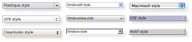
主题:
设置一个样式
应用程序的整体样式可以调用 QApplication::setStyle() 函数设置. 它也可以使用命令行参数 -style 设置:
./myapplication -style windows
如果没有设置样式, Qt 选用最接近用户平台或桌面环境的样式.
你也可以调用 QWidget::setStyle() 函数为特定的 widget 设置样式.
开发自定义 widget 样式
如果你正在开发自定义 widget, 使所有平台具有良好的外观, 你可以使用 QStyle 函数绘制 widget 的部分内容, 如 drawItemText(), drawItemPixmap(), drawPrimitive(), drawControl(), drawComplexControl().
QStyle 的大部分绘图函数需要 4 个参数:
- 一个枚举值, 指定绘图元素
- QStyleOption 表明如何绘制元素及绘制在何处
- QPainter 绘制者
- QWidget 绘制目标 (可选参数)
例如, 如果你想在 widget 上绘制具有焦点的矩形, 代码如下:
  void MyWidget::paintEvent(QPaintEvent * /* event */)
  {
      QPainter painter(this);

      QStyleOptionFocusRect option;
      option.initFrom(this);
      option.backgroundColor = palette().color(QPalette::Background);

      style()->drawPrimitive(QStyle::PE_FrameFocusRect, &option, &painter, this);
  }
QStyle 从 QStyleOption 获取图形元素的所有绘制信息. 这个 widget 作为最后一个参数传递, 以防样式需要它绘制特殊效果 (如 macOS 上的动画默认按钮), 但这个不是强制性的. 事实上, 设置好 QPainter, 你可以使用 QStyle 在任何绘画设备上绘图, 而不仅仅是 widget.
QStyleOption 有多个派生类, 可以绘制各种类型的图形元素. 例如, PE_FrameFocusRect 需要 QStyleOptionFocusRect 参数.
为确保绘图操作尽可能快, QStyleOption 及其子类具有公共数据成员. 如何使用它们, 参见 QStyleOption.
方便起见, Qt 提供了 QStylePainter, 它组合了一个 QStyle, 一个 QPainter, 和一个 QWidget. 你的代码可以写成
      QStylePainter painter(this);
      ...
      painter.drawPrimitive(QStyle::PE_FrameFocusRect, option);
替代
      QPainter painter(this);
      ...
      style()->drawPrimitive(QStyle::PE_FrameFocusRect, &option, &painter, this);
Creating a Custom Style
你可以创建自定义样式, 为应用程序创建自定义外观. 创建自定义样式有两种方法. 在静态方法中, 你可以选择子类化现有的 QStyle, 重新实现它的虚函数, 或者你从头开始创建整个 QStyle. 在动态方法中, 你可以在运行时修改系统样式的行为. 下面描述静态方法. QProxyStyle 描述了动态方法.
静态方法的第一步是选择 Qt 提供的样式之一. 你对 QStyle 的选择取决于哪种样式与你想要的样式最相似. QCommonStyle 是最基础, 通用的类(不是 QStyle). 因为 Qt 要求它的样式是 QCommonStyle.
根据你想要更改基本样式的哪些部分, 你必须重新实现用于绘制界面的这些部分的函数. 为了说明这一点, 我们将修改 QWindowsStyle 绘制的旋转框箭头的外观. 箭头是由 drawPrimitive() 函数绘制的原始元素, 因此我们需要重新实现这个函数. 我们需要以下类声明:
  class CustomStyle : public QProxyStyle
  {
      Q_OBJECT

  public:
      CustomStyle();
      ~CustomStyle() {}

      void drawPrimitive(PrimitiveElement element, const QStyleOption *option,
                         QPainter *painter, const QWidget *widget) const;
  };
为了绘制向上和向下箭头, QSpinBox 使用 PE_IndicatorSpinUp 和 PE_IndicatorSpinDown 基本元素. 下面是如何重新实现 drawPrimitive() 函数, 以不同的方式绘制它们:
  void CustomStyle::drawPrimitive(PrimitiveElement element, const QStyleOption *option,
                                  QPainter *painter, const QWidget *widget) const
  {
      if (element == PE_IndicatorSpinUp || element == PE_IndicatorSpinDown) {
          QPolygon points(3);
          int x = option->rect.x();
          int y = option->rect.y();
          int w = option->rect.width() / 2;
          int h = option->rect.height() / 2;
          x += (option->rect.width() - w) / 2;
          y += (option->rect.height() - h) / 2;

          if (element == PE_IndicatorSpinUp) {
              points[0] = QPoint(x, y + h);
              points[1] = QPoint(x + w, y + h);
              points[2] = QPoint(x + w / 2, y);
          } else { // PE_SpinBoxDown
              points[0] = QPoint(x, y);
              points[1] = QPoint(x + w, y);
              points[2] = QPoint(x + w / 2, y + h);
          }

          if (option->state & State_Enabled) {
              painter->setPen(option->palette.mid().color());
              painter->setBrush(option->palette.buttonText());
          } else {
              painter->setPen(option->palette.buttonText().color());
              painter->setBrush(option->palette.mid());
          }
          painter->drawPolygon(points);
      } else {
      QProxyStyle::drawPrimitive(element, option, painter, widget);
      }
  }
注意, 我们不使用 widget 参数, 只是将其传递给 QWindowStyle::drawPrimitive() 函数. 如上所述, QStyleOption 指定关于绘制什么, 及如何绘制, 因此不需要询问 widget.
如果你需要使用 widget 参数获取信息, 必须在使用前确保它不是 0, 且类型正确. 如:
      const QSpinBox *spinBox = qobject_cast<const QSpinBox *>(widget);
      if (spinBox) {
      ...
      }
在实现自定义样式时, 你不能仅仅因为枚举值是 PE_IndicatorSpinUp 或 PE_IndicatorSpinDown, 就假设 widget 是 QSpinBox.
详见 Styles.
警告: 自定义 QStyle 子类当前不支持 Qt 样式表. 我们计划在未来的版本中解决这个问题.
Using a Custom Style
在 Qt 应用程序中使用自定义样式的方法有多种. 最简单的方法是在创建 QApplication 对象之前将自定义样式传递给 QApplication::setStyle() 静态函数:
  #include <QtWidgets>

  #include "customstyle.h"

  int main(int argc, char *argv[])
  {
      QApplication::setStyle(new CustomStyle);
      QApplication app(argc, argv);
      QSpinBox spinBox;
      spinBox.show();
      return app.exec();
  }
你可以随时调用 QApplication::setStyle(), 但是通过在构造函数之前调用它, 可以确保尊重用户使用 -style 命令行选项设置的首选项.
你可能希望使你的自定义样式可在其他应用程序中使用, 这些应用程序可能不属于你, 因此无法重新编译. Qt 插件系统可以将样式创建为插件. 作为插件创建的样式在运行时由 Qt 加载为共享对象. 有关如何创建样式插件, 参见 Qt Plugin.
编译你的插件, 并放入 Qt 的 plugins/styles 目录中. 我们现在有了 Qt 可以自动加载的可插入样式. 要将新样式与现有应用程序一起使用, 只需使用以下参数启动应用程序:
./myapplication -style custom
应用程序将使用你实现的自定义样式的外观.
从右到左的桌面
从右到左书写的语言 (例如阿拉伯语和希伯来语) 通常也会反映 widget 的整个布局, 并且要求光线来自屏幕的右上角而不是左上角.
如果你创建自定义样式, 则在绘制不对称元素时应特别小心, 以确保它们在镜像布局中也看起来正确. 测试样式的一个简单方法是使用 -reverse 命令行选项运行应用程序, 或在 main() 函数中调用 QApplication::setLayoutDirection().
让样式在从右到左的环境中正常工作时需要记住以下几点:
- subControlRect() 和 subElementRect() 返回屏幕坐标中的矩形
- QStyleOption::direction 指示项目应沿哪个方向绘制
- 如果样式不能识别从右到左, 它将像从左到右一样显示项目
- visualRect(), visualPos(), visualAlignment() 是有用的函数, 可以将逻辑表示转换为屏幕表示.
- alignedRect() 将返回一个与当前方向对齐的逻辑矩形
项目视图中的样式
视图中项目的绘制由委托执行. Qt 的默认委托是 QStyledItemDelegate, 还用于计算项目的边界矩形以及 QStyledItemDelegate 支持的各种项目数据角色的子元素. 有关这个类支持哪些数据类型和角色, 参见 QStyledItemDelegate, 有关项目角色的更多信息, 参见 Model/View Programming.
QStyledItemDelegate 绘制项目时, 他会绘制 CE_ItemViewItem, 并使用 CT_ItemViewItem 计算大小. 注意: 它使用 SE_ItemViewItemText 设置编辑器的大小. 实现样式自定义项目视图的绘制时, 你需要检查 QCommonStyle (以及你的样式继承的任何其他子类) 的实现. 通过这种方式, 你可以找出哪些样式元素以及如何绘制其他样式元素, 然后可以重新实现应该以不同方式绘制的元素的绘制.
我们提供了一个小示例, 自定义项目背景的绘制.
      switch (element) {
          case (PE_PanelItemViewItem): {
              painter->save();

              QPoint topLeft = option->rect.topLeft();
              QPoint bottomRight = option->rect.topRight();
              QLinearGradient backgroundGradient(topLeft, bottomRight);
              backgroundGradient.setColorAt(0.0, QColor(Qt::yellow).lighter(190));
              backgroundGradient.setColorAt(1.0, Qt::white);
              painter->fillRect(option->rect, QBrush(backgroundGradient));

              painter->restore();
          break;
          }
          default:
              QProxyStyle::drawPrimitive(element, option, painter, widget);
      }
原始元素 PE_PanelItemViewItem 负责绘制项目的背景, 并从 QCommonStyle 的 CE_ItemViewItem 实现中调用.
要添加对绘制新数据类型和项目数据角色的支持, 有必要创建自定义委托. 但是, 如果你只需要支持默认委托实现的数据类型, 则自定义样式不需要随附的委托. 有关自定义委托的更多信息, 参见 QStyledItemDelegate.
项目视图标题的绘制也是由样式完成的, 可以控制标题项目的大小以及行和列的大小.
参见 QStyleOption, QStylePainter, Styles Example, Styles and Style Aware Widgets, QStyledItemDelegate, Styling.
成员类型
enum QStyle::ComplexControl
This enum describes the available complex controls. Complex controls have different behavior depending upon where the user clicks on them or which keys are pressed.
| Constant | Value | Description |
|---|---|---|
QStyle::CC_SpinBox | 0 | A spinbox, like QSpinBox. |
QStyle::CC_ComboBox | 1 | A combobox, like QComboBox. |
QStyle::CC_ScrollBar | 2 | A scroll bar, like QScrollBar. |
QStyle::CC_Slider | 3 | A slider, like QSlider. |
QStyle::CC_ToolButton | 4 | A tool button, like QToolButton. |
QStyle::CC_TitleBar | 5 | A Title bar, like those used in QMdiSubWindow. |
QStyle::CC_GroupBox | 7 | A group box, like QGroupBox. |
QStyle::CC_Dial | 6 | A dial, like QDial. |
QStyle::CC_MdiControls | 8 | The minimize, close, and normal button in the menu bar for a maximized MDI subwindow. |
QStyle::CC_CustomBase | 0xf0000000 | Base value for custom complex controls. Custom values must be greater than this value. |
参见 SubControl and drawComplexControl().
enum QStyle::ContentsType
This enum describes the available contents types. These are used to calculate sizes for the contents of various widgets.
| Constant | Value | Description |
|---|---|---|
QStyle::CT_CheckBox | 1 | A check box, like QCheckBox. |
QStyle::CT_ComboBox | 4 | A combo box, like QComboBox. |
QStyle::CT_HeaderSection | 19 | A header section, like QHeader. |
QStyle::CT_LineEdit | 14 | A line edit, like QLineEdit. |
QStyle::CT_Menu | 10 | A menu, like QMenu. |
QStyle::CT_MenuBar | 9 | A menu bar, like QMenuBar. |
QStyle::CT_MenuBarItem | 8 | A menu bar item, like the buttons in a QMenuBar. |
QStyle::CT_MenuItem | 7 | A menu item, like QMenuItem. |
QStyle::CT_ProgressBar | 6 | A progress bar, like QProgressBar. |
QStyle::CT_PushButton | 0 | A push button, like QPushButton. |
QStyle::CT_RadioButton | 2 | A radio button, like QRadioButton. |
QStyle::CT_SizeGrip | 16 | A size grip, like QSizeGrip. |
QStyle::CT_Slider | 12 | A slider, like QSlider. |
QStyle::CT_ScrollBar | 13 | A scroll bar, like QScrollBar. |
QStyle::CT_SpinBox | 15 | A spin box, like QSpinBox. |
QStyle::CT_Splitter | 5 | A splitter, like QSplitter. |
QStyle::CT_TabBarTab | 11 | A tab on a tab bar, like QTabBar. |
QStyle::CT_TabWidget | 17 | A tab widget, like QTabWidget. |
QStyle::CT_ToolButton | 3 | A tool button, like QToolButton. |
QStyle::CT_GroupBox | 20 | A group box, like QGroupBox. |
QStyle::CT_ItemViewItem | 22 | An item inside an item view. |
QStyle::CT_CustomBase | 0xf0000000 | Base value for custom contents types. Custom values must be greater than this value. |
QStyle::CT_MdiControls | 21 | The minimize, normal, and close button in the menu bar for a maximized MDI subwindow. |
参见 sizeFromContents().
enum QStyle::ControlElement
This enum represents a control element. A control element is a part of a widget that performs some action or displays information to the user.
| Constant | Value | Description |
|---|---|---|
QStyle::CE_PushButton | 0 | A QPushButton, draws CE_PushButtonBevel, CE_PushButtonLabel and PE_FrameFocusRect. |
QStyle::CE_PushButtonBevel | 1 | The bevel and default indicator of a QPushButton. |
QStyle::CE_PushButtonLabel | 2 | The label (an icon with text or pixmap) of a QPushButton. |
QStyle::CE_DockWidgetTitle | 30 | Dock window title. |
QStyle::CE_Splitter | 28 | Splitter handle; see also QSplitter. |
QStyle::CE_CheckBox | 3 | A QCheckBox, draws a PE_IndicatorCheckBox, a CE_CheckBoxLabel and a PE_FrameFocusRect. |
QStyle::CE_CheckBoxLabel | 4 | The label (text or pixmap) of a QCheckBox. |
QStyle::CE_RadioButton | 5 | A QRadioButton, draws a PE_IndicatorRadioButton, a CE_RadioButtonLabel and a PE_FrameFocusRect. |
QStyle::CE_RadioButtonLabel | 6 | The label (text or pixmap) of a QRadioButton. |
QStyle::CE_TabBarTab | 7 | The tab and label within a QTabBar. |
QStyle::CE_TabBarTabShape | 8 | The tab shape within a tab bar. |
QStyle::CE_TabBarTabLabel | 9 | The label within a tab. |
QStyle::CE_ProgressBar | 10 | A QProgressBar, draws CE_ProgressBarGroove, CE_ProgressBarContents and CE_ProgressBarLabel. |
QStyle::CE_ProgressBarGroove | 11 | The groove where the progress indicator is drawn in a QProgressBar. |
QStyle::CE_ProgressBarContents | 12 | The progress indicator of a QProgressBar. |
QStyle::CE_ProgressBarLabel | 13 | The text label of a QProgressBar. |
QStyle::CE_ToolButtonLabel | 22 | A tool button's label. |
QStyle::CE_MenuBarItem | 20 | A menu item in a QMenuBar. |
QStyle::CE_MenuBarEmptyArea | 21 | The empty area of a QMenuBar. |
QStyle::CE_MenuItem | 14 | A menu item in a QMenu. |
QStyle::CE_MenuScroller | 15 | Scrolling areas in a QMenu when the style supports scrolling. |
QStyle::CE_MenuTearoff | 18 | A menu item representing the tear off section of a QMenu. |
QStyle::CE_MenuEmptyArea | 19 | The area in a menu without menu items. |
QStyle::CE_MenuHMargin | 17 | The horizontal extra space on the left/right of a menu. |
QStyle::CE_MenuVMargin | 16 | The vertical extra space on the top/bottom of a menu. |
QStyle::CE_ToolBoxTab | 26 | The toolbox's tab and label within a QToolBox. |
QStyle::CE_SizeGrip | 27 | Window resize handle; see also QSizeGrip. |
QStyle::CE_Header | 23 | A header. |
QStyle::CE_HeaderSection | 24 | A header section. |
QStyle::CE_HeaderLabel | 25 | The header's label. |
QStyle::CE_ScrollBarAddLine | 31 | Scroll bar line increase indicator. (i.e., scroll down); see also QScrollBar. |
QStyle::CE_ScrollBarSubLine | 32 | Scroll bar line decrease indicator (i.e., scroll up). |
QStyle::CE_ScrollBarAddPage | 33 | Scolllbar page increase indicator (i.e., page down). |
QStyle::CE_ScrollBarSubPage | 34 | Scroll bar page decrease indicator (i.e., page up). |
QStyle::CE_ScrollBarSlider | 35 | Scroll bar slider. |
QStyle::CE_ScrollBarFirst | 36 | Scroll bar first line indicator (i.e., home). |
QStyle::CE_ScrollBarLast | 37 | Scroll bar last line indicator (i.e., end). |
QStyle::CE_RubberBand | 29 | Rubber band used in for example an icon view. |
QStyle::CE_FocusFrame | 38 | Focus frame that is style controlled. |
QStyle::CE_ItemViewItem | 45 | An item inside an item view. |
QStyle::CE_CustomBase | 0xf0000000 | Base value for custom control elements; custom values must be greater than this value. |
QStyle::CE_ComboBoxLabel | 39 | The label of a non-editable QComboBox. |
QStyle::CE_ToolBar | 40 | A toolbar like QToolBar. |
QStyle::CE_ToolBoxTabShape | 41 | The toolbox's tab shape. |
QStyle::CE_ToolBoxTabLabel | 42 | The toolbox's tab label. |
QStyle::CE_HeaderEmptyArea | 43 | The area of a header view where there are no header sections. |
QStyle::CE_ShapedFrame | 46 | The frame with the shape specified in the QStyleOptionFrame; see QFrame. |
参见 drawControl().
enum QStyle::PixelMetric
This enum describes the various available pixel metrics. A pixel metric is a style dependent size represented by a single pixel value.
| Constant | Value | Description |
|---|---|---|
QStyle::PM_ButtonMargin | 0 | Amount of whitespace between push button labels and the frame. |
QStyle::PM_DockWidgetTitleBarButtonMargin | ? | Amount of whitespace between dock widget's title bar button labels and the frame. |
QStyle::PM_ButtonDefaultIndicator | 1 | Width of the default-button indicator frame. |
QStyle::PM_MenuButtonIndicator | 2 | Width of the menu button indicator proportional to the widget height. |
QStyle::PM_ButtonShiftHorizontal | 3 | Horizontal contents shift of a button when the button is down. |
QStyle::PM_ButtonShiftVertical | 4 | Vertical contents shift of a button when the button is down. |
QStyle::PM_DefaultFrameWidth | 5 | Default frame width (usually 2). |
QStyle::PM_SpinBoxFrameWidth | 6 | Frame width of a spin box, defaults to PM_DefaultFrameWidth. |
QStyle::PM_ComboBoxFrameWidth | 7 | Frame width of a combo box, defaults to PM_DefaultFrameWidth. |
QStyle::PM_MDIFrameWidth | PM_MdiSubWindowFrameWidth | Obsolete. Use PM_MdiSubWindowFrameWidth instead. |
QStyle::PM_MdiSubWindowFrameWidth | 44 | Frame width of an MDI window. |
QStyle::PM_MDIMinimizedWidth | PM_MdiSubWindowMinimizedWidth | Obsolete. Use PM_MdiSubWindowMinimizedWidth instead. |
QStyle::PM_MdiSubWindowMinimizedWidth | ? | Width of a minimized MDI window. |
QStyle::PM_LayoutLeftMargin | ? | Default left margin for a QLayout. |
QStyle::PM_LayoutTopMargin | ? | Default top margin for a QLayout. |
QStyle::PM_LayoutRightMargin | ? | Default right margin for a QLayout. |
QStyle::PM_LayoutBottomMargin | ? | Default bottom margin for a QLayout. |
QStyle::PM_LayoutHorizontalSpacing | ? | Default horizontal spacing for a QLayout. |
QStyle::PM_LayoutVerticalSpacing | ? | Default vertical spacing for a QLayout. |
QStyle::PM_MaximumDragDistance | 8 | The maximum allowed distance between the mouse and a scrollbar when dragging. Exceeding the specified distance will cause the slider to jump back to the original position; a value of -1 disables this behavior. |
QStyle::PM_ScrollBarExtent | 9 | Width of a vertical scroll bar and the height of a horizontal scroll bar. |
QStyle::PM_ScrollBarSliderMin | 10 | The minimum height of a vertical scroll bar's slider and the minimum width of a horizontal scroll bar's slider. |
QStyle::PM_SliderThickness | 11 | Total slider thickness. |
QStyle::PM_SliderControlThickness | 12 | Thickness of the slider handle. |
QStyle::PM_SliderLength | 13 | Length of the slider. |
QStyle::PM_SliderTickmarkOffset | 14 | The offset between the tickmarks and the slider. |
QStyle::PM_SliderSpaceAvailable | 15 | The available space for the slider to move. |
QStyle::PM_DockWidgetSeparatorExtent | 16 | Width of a separator in a horizontal dock window and the height of a separator in a vertical dock window. |
QStyle::PM_DockWidgetHandleExtent | 17 | Width of the handle in a horizontal dock window and the height of the handle in a vertical dock window. |
QStyle::PM_DockWidgetFrameWidth | 18 | Frame width of a dock window. |
QStyle::PM_DockWidgetTitleMargin | ? | Margin of the dock window title. |
QStyle::PM_MenuBarPanelWidth | 33 | Frame width of a menu bar, defaults to PM_DefaultFrameWidth. |
QStyle::PM_MenuBarItemSpacing | 34 | Spacing between menu bar items. |
QStyle::PM_MenuBarHMargin | 36 | Spacing between menu bar items and left/right of bar. |
QStyle::PM_MenuBarVMargin | 35 | Spacing between menu bar items and top/bottom of bar. |
QStyle::PM_ToolBarFrameWidth | ? | Width of the frame around toolbars. |
QStyle::PM_ToolBarHandleExtent | ? | Width of a toolbar handle in a horizontal toolbar and the height of the handle in a vertical toolbar. |
QStyle::PM_ToolBarItemMargin | ? | Spacing between the toolbar frame and the items. |
QStyle::PM_ToolBarItemSpacing | ? | Spacing between toolbar items. |
QStyle::PM_ToolBarSeparatorExtent | ? | Width of a toolbar separator in a horizontal toolbar and the height of a separator in a vertical toolbar. |
QStyle::PM_ToolBarExtensionExtent | ? | Width of a toolbar extension button in a horizontal toolbar and the height of the button in a vertical toolbar. |
QStyle::PM_TabBarTabOverlap | 19 | Number of pixels the tabs should overlap. (Currently only used in styles, not inside of QTabBar) |
QStyle::PM_TabBarTabHSpace | 20 | Extra space added to the tab width. |
QStyle::PM_TabBarTabVSpace | 21 | Extra space added to the tab height. |
QStyle::PM_TabBarBaseHeight | 22 | Height of the area between the tab bar and the tab pages. |
QStyle::PM_TabBarBaseOverlap | 23 | Number of pixels the tab bar overlaps the tab bar base. |
QStyle::PM_TabBarScrollButtonWidth | ? | |
QStyle::PM_TabBarTabShiftHorizontal | ? | Horizontal pixel shift when a tab is selected. |
QStyle::PM_TabBarTabShiftVertical | ? | Vertical pixel shift when a tab is selected. |
QStyle::PM_ProgressBarChunkWidth | 24 | Width of a chunk in a progress bar indicator. |
QStyle::PM_SplitterWidth | 25 | Width of a splitter. |
QStyle::PM_TitleBarHeight | 26 | Height of the title bar. |
QStyle::PM_IndicatorWidth | 37 | Width of a check box indicator. |
QStyle::PM_IndicatorHeight | 38 | Height of a checkbox indicator. |
QStyle::PM_ExclusiveIndicatorWidth | 39 | Width of a radio button indicator. |
QStyle::PM_ExclusiveIndicatorHeight | 40 | Height of a radio button indicator. |
QStyle::PM_MenuPanelWidth | 30 | Border width (applied on all sides) for a QMenu. |
QStyle::PM_MenuHMargin | 28 | Additional border (used on left and right) for a QMenu. |
QStyle::PM_MenuVMargin | 29 | Additional border (used for bottom and top) for a QMenu. |
QStyle::PM_MenuScrollerHeight | 27 | Height of the scroller area in a QMenu. |
QStyle::PM_MenuTearoffHeight | 31 | Height of a tear off area in a QMenu. |
QStyle::PM_MenuDesktopFrameWidth | 32 | The frame width for the menu on the desktop. |
QStyle::PM_HeaderMarkSize | ? | The size of the sort indicator in a header. |
QStyle::PM_HeaderGripMargin | ? | The size of the resize grip in a header. |
QStyle::PM_HeaderMargin | ? | The size of the margin between the sort indicator and the text. |
QStyle::PM_SpinBoxSliderHeight | ? | The height of the optional spin box slider. |
QStyle::PM_ToolBarIconSize | ? | Default tool bar icon size |
QStyle::PM_SmallIconSize | ? | Default small icon size |
QStyle::PM_LargeIconSize | ? | Default large icon size |
QStyle::PM_FocusFrameHMargin | ? | Horizontal margin that the focus frame will outset the widget by. |
QStyle::PM_FocusFrameVMargin | ? | Vertical margin that the focus frame will outset the widget by. |
QStyle::PM_IconViewIconSize | ? | The default size for icons in an icon view. |
QStyle::PM_ListViewIconSize | ? | The default size for icons in a list view. |
QStyle::PM_ToolTipLabelFrameWidth | ? | The frame width for a tool tip label. |
QStyle::PM_CheckBoxLabelSpacing | ? | The spacing between a check box indicator and its label. |
QStyle::PM_RadioButtonLabelSpacing | ? | The spacing between a radio button indicator and its label. |
QStyle::PM_TabBarIconSize | ? | The default icon size for a tab bar. |
QStyle::PM_SizeGripSize | ? | The size of a size grip. |
QStyle::PM_MessageBoxIconSize | ? | The size of the standard icons in a message box |
QStyle::PM_ButtonIconSize | ? | The default size of button icons |
QStyle::PM_TextCursorWidth | ? | The width of the cursor in a line edit or text edit |
QStyle::PM_TabBar_ScrollButtonOverlap | ? | The distance between the left and right buttons in a tab bar. |
QStyle::PM_TabCloseIndicatorWidth | ? | The default width of a close button on a tab in a tab bar. |
QStyle::PM_TabCloseIndicatorHeight | ? | The default height of a close button on a tab in a tab bar. |
QStyle::PM_ScrollView_ScrollBarSpacing | ? | Distance between frame and scrollbar with SH_ScrollView_FrameOnlyAroundContents set. |
QStyle::PM_ScrollView_ScrollBarOverlap | ? | Overlap between scroll bars and scroll content |
QStyle::PM_SubMenuOverlap | ? | The horizontal overlap between a submenu and its parent. |
QStyle::PM_TreeViewIndentation | ? | The indentation of items in a tree view. This enum value has been introduced in Qt 5.4. |
QStyle::PM_HeaderDefaultSectionSizeHorizontal | ? | The default size of sections in a horizontal header. This enum value has been introduced in Qt 5.5. |
QStyle::PM_HeaderDefaultSectionSizeVertical | ? | The default size of sections in a vertical header. This enum value has been introduced in Qt 5.5. |
QStyle::PM_TitleBarButtonIconSize | ? | The size of button icons on a title bar. This enum value has been introduced in Qt 5.8. |
QStyle::PM_TitleBarButtonSize | ? | The size of buttons on a title bar. This enum value has been introduced in Qt 5.8. |
QStyle::PM_CustomBase | 0xf0000000 | Base value for custom pixel metrics. Custom values must be greater than this value. |
The following values are obsolete:
| Constant | Value | Description |
|---|---|---|
QStyle::PM_DefaultTopLevelMargin | ? | Use PM_LayoutLeftMargin, PM_LayoutTopMargin, PM_LayoutRightMargin, and PM_LayoutBottomMargin instead. |
QStyle::PM_DefaultChildMargin | ? | Use PM_LayoutLeftMargin, PM_LayoutTopMargin, PM_LayoutRightMargin, and PM_LayoutBottomMargin instead. |
QStyle::PM_DefaultLayoutSpacing | ? | Use PM_LayoutHorizontalSpacing and PM_LayoutVerticalSpacing instead. |
参见 pixelMetric().
enum QStyle::PrimitiveElement
This enum describes the various primitive elements. A primitive element is a common GUI element, such as a checkbox indicator or button bevel.
| Constant | Value | Description |
|---|---|---|
QStyle::PE_FrameStatusBar | 7 | Obsolete. Use PE_FrameStatusBarItem instead. |
QStyle::PE_PanelButtonCommand | ? | Button used to initiate an action, for example, a QPushButton. |
QStyle::PE_FrameDefaultButton | 1 | This frame around a default button, e.g. in a dialog. |
QStyle::PE_PanelButtonBevel | ? | Generic panel with a button bevel. |
QStyle::PE_PanelButtonTool | ? | Panel for a Tool button, used with QToolButton. |
QStyle::PE_PanelLineEdit | ? | Panel for a QLineEdit. |
QStyle::PE_IndicatorButtonDropDown | ? | Indicator for a drop down button, for example, a tool button that displays a menu. |
QStyle::PE_FrameFocusRect | 3 | Generic focus indicator. |
QStyle::PE_IndicatorArrowUp | ? | Generic Up arrow. |
QStyle::PE_IndicatorArrowDown | ? | Generic Down arrow. |
QStyle::PE_IndicatorArrowRight | ? | Generic Right arrow. |
QStyle::PE_IndicatorArrowLeft | ? | Generic Left arrow. |
QStyle::PE_IndicatorSpinUp | ? | Up symbol for a spin widget, for example a QSpinBox. |
QStyle::PE_IndicatorSpinDown | ? | Down symbol for a spin widget. |
QStyle::PE_IndicatorSpinPlus | ? | Increase symbol for a spin widget. |
QStyle::PE_IndicatorSpinMinus | ? | Decrease symbol for a spin widget. |
QStyle::PE_IndicatorItemViewItemCheck | PE_IndicatorViewItemCheck | On/off indicator for a view item. |
QStyle::PE_IndicatorCheckBox | ? | On/off indicator, for example, a QCheckBox. |
QStyle::PE_IndicatorRadioButton | ? | Exclusive on/off indicator, for example, a QRadioButton. |
QStyle::PE_IndicatorDockWidgetResizeHandle | ? | Resize handle for dock windows. |
QStyle::PE_Frame | 0 | Generic frame |
QStyle::PE_FrameMenu | 6 | Frame for popup windows/menus; see also QMenu. |
QStyle::PE_PanelMenuBar | ? | Panel for menu bars. |
QStyle::PE_PanelScrollAreaCorner | ? | Panel at the bottom-right (or bottom-left) corner of a scroll area. |
QStyle::PE_FrameDockWidget | 2 | Panel frame for dock windows and toolbars. |
QStyle::PE_FrameTabWidget | ? | Frame for tab widgets. |
QStyle::PE_FrameLineEdit | 5 | Panel frame for line edits. |
QStyle::PE_FrameGroupBox | 4 | Panel frame around group boxes. |
QStyle::PE_FrameButtonBevel | ? | Panel frame for a button bevel. |
QStyle::PE_FrameButtonTool | ? | Panel frame for a tool button. |
QStyle::PE_IndicatorHeaderArrow | ? | Arrow used to indicate sorting on a list or table header. |
QStyle::PE_FrameStatusBarItem | PE_FrameStatusBar | Frame for an item of a status bar; see also QStatusBar. |
QStyle::PE_FrameWindow | ? | Frame around a MDI window or a docking window. |
QStyle::PE_IndicatorMenuCheckMark | ? | Check mark used in a menu. |
QStyle::PE_IndicatorProgressChunk | ? | Section of a progress bar indicator; see also QProgressBar. |
QStyle::PE_IndicatorBranch | ? | Lines used to represent the branch of a tree in a tree view. |
QStyle::PE_IndicatorToolBarHandle | ? | The handle of a toolbar. |
QStyle::PE_IndicatorToolBarSeparator | ? | The separator in a toolbar. |
QStyle::PE_PanelToolBar | ? | The panel for a toolbar. |
QStyle::PE_PanelTipLabel | ? | The panel for a tip label. |
QStyle::PE_FrameTabBarBase | ? | The frame that is drawn for a tab bar, ususally drawn for a tab bar that isn't part of a tab widget. |
QStyle::PE_IndicatorTabTear | ? | Deprecated. Use PE_IndicatorTabTearLeft instead. |
QStyle::PE_IndicatorTabTearLeft | PE_IndicatorTabTear | An indicator that a tab is partially scrolled out on the left side of the visible tab bar when there are many tabs. |
QStyle::PE_IndicatorTabTearRight | ? | An indicator that a tab is partially scrolled out on the right side of the visible tab bar when there are many tabs. |
QStyle::PE_IndicatorColumnViewArrow | ? | An arrow in a QColumnView. |
QStyle::PE_Widget | ? | A plain QWidget. |
QStyle::PE_CustomBase | 0xf000000 | Base value for custom primitive elements. All values above this are reserved for custom use. Custom values must be greater than this value. |
QStyle::PE_IndicatorItemViewItemDrop | ? | An indicator that is drawn to show where an item in an item view is about to be dropped during a drag-and-drop operation in an item view. |
QStyle::PE_PanelItemViewItem | ? | The background for an item in an item view. |
QStyle::PE_PanelItemViewRow | ? | The background of a row in an item view. |
QStyle::PE_PanelStatusBar | ? | The panel for a status bar. |
QStyle::PE_IndicatorTabClose | ? | The close button on a tab bar. |
QStyle::PE_PanelMenu | ? | The panel for a menu. |
参见 drawPrimitive().
enum QStyle::RequestSoftwareInputPanel
This enum describes under what circumstances a software input panel will be requested by input capable widgets.
| Constant | Value | Description |
|---|---|---|
QStyle::RSIP_OnMouseClickAndAlreadyFocused | 0 | Requests an input panel if the user clicks on the widget, but only if it is already focused. |
QStyle::RSIP_OnMouseClick | 1 | Requests an input panel if the user clicks on the widget. |
参见 QInputMethod.
enum QStyle::StandardPixmap
This enum describes the available standard pixmaps. A standard pixmap is a pixmap that can follow some existing GUI style or guideline.
| Constant | Value | Description |
|---|---|---|
QStyle::SP_TitleBarMinButton | 1 | Minimize button on title bars (e.g., in QMdiSubWindow). |
QStyle::SP_TitleBarMenuButton | 0 | Menu button on a title bar. |
QStyle::SP_TitleBarMaxButton | 2 | Maximize button on title bars. |
QStyle::SP_TitleBarCloseButton | 3 | Close button on title bars. |
QStyle::SP_TitleBarNormalButton | 4 | Normal (restore) button on title bars. |
QStyle::SP_TitleBarShadeButton | 5 | Shade button on title bars. |
QStyle::SP_TitleBarUnshadeButton | 6 | Unshade button on title bars. |
QStyle::SP_TitleBarContextHelpButton | 7 | The Context help button on title bars. |
QStyle::SP_MessageBoxInformation | 9 | The "information" icon. |
QStyle::SP_MessageBoxWarning | 10 | The "warning" icon. |
QStyle::SP_MessageBoxCritical | 11 | The "critical" icon. |
QStyle::SP_MessageBoxQuestion | 12 | The "question" icon. |
QStyle::SP_DesktopIcon | 13 | The "desktop" icon. |
QStyle::SP_TrashIcon | 14 | The "trash" icon. |
QStyle::SP_ComputerIcon | 15 | The "My computer" icon. |
QStyle::SP_DriveFDIcon | 16 | The floppy icon. |
QStyle::SP_DriveHDIcon | 17 | The harddrive icon. |
QStyle::SP_DriveCDIcon | 18 | The CD icon. |
QStyle::SP_DriveDVDIcon | 19 | The DVD icon. |
QStyle::SP_DriveNetIcon | 20 | The network icon. |
QStyle::SP_DirHomeIcon | 56 | The home directory icon. |
QStyle::SP_DirOpenIcon | 21 | The open directory icon. |
QStyle::SP_DirClosedIcon | 22 | The closed directory icon. |
QStyle::SP_DirIcon | 38 | The directory icon. |
QStyle::SP_DirLinkIcon | 23 | The link to directory icon. |
QStyle::SP_DirLinkOpenIcon | 24 | The link to open directory icon. |
QStyle::SP_FileIcon | 25 | The file icon. |
QStyle::SP_FileLinkIcon | 26 | The link to file icon. |
QStyle::SP_FileDialogStart | 29 | The "start" icon in a file dialog. |
QStyle::SP_FileDialogEnd | 30 | The "end" icon in a file dialog. |
QStyle::SP_FileDialogToParent | 31 | The "parent directory" icon in a file dialog. |
QStyle::SP_FileDialogNewFolder | 32 | The "create new folder" icon in a file dialog. |
QStyle::SP_FileDialogDetailedView | 33 | The detailed view icon in a file dialog. |
QStyle::SP_FileDialogInfoView | 34 | The file info icon in a file dialog. |
QStyle::SP_FileDialogContentsView | 35 | The contents view icon in a file dialog. |
QStyle::SP_FileDialogListView | 36 | The list view icon in a file dialog. |
QStyle::SP_FileDialogBack | 37 | The back arrow in a file dialog. |
QStyle::SP_DockWidgetCloseButton | 8 | Close button on dock windows (see also QDockWidget). |
QStyle::SP_ToolBarHorizontalExtensionButton | 27 | Extension button for horizontal toolbars. |
QStyle::SP_ToolBarVerticalExtensionButton | 28 | Extension button for vertical toolbars. |
QStyle::SP_DialogOkButton | 39 | Icon for a standard OK button in a QDialogButtonBox. |
QStyle::SP_DialogCancelButton | 40 | Icon for a standard Cancel button in a QDialogButtonBox. |
QStyle::SP_DialogHelpButton | 41 | Icon for a standard Help button in a QDialogButtonBox. |
QStyle::SP_DialogOpenButton | 42 | Icon for a standard Open button in a QDialogButtonBox. |
QStyle::SP_DialogSaveButton | 43 | Icon for a standard Save button in a QDialogButtonBox. |
QStyle::SP_DialogCloseButton | 44 | Icon for a standard Close button in a QDialogButtonBox. |
QStyle::SP_DialogApplyButton | 45 | Icon for a standard Apply button in a QDialogButtonBox. |
QStyle::SP_DialogResetButton | 46 | Icon for a standard Reset button in a QDialogButtonBox. |
QStyle::SP_DialogDiscardButton | 47 | Icon for a standard Discard button in a QDialogButtonBox. |
QStyle::SP_DialogYesButton | 48 | Icon for a standard Yes button in a QDialogButtonBox. |
QStyle::SP_DialogNoButton | 49 | Icon for a standard No button in a QDialogButtonBox. |
QStyle::SP_ArrowUp | 50 | Icon arrow pointing up. |
QStyle::SP_ArrowDown | 51 | Icon arrow pointing down. |
QStyle::SP_ArrowLeft | 52 | Icon arrow pointing left. |
QStyle::SP_ArrowRight | 53 | Icon arrow pointing right. |
QStyle::SP_ArrowBack | 54 | Equivalent to SP_ArrowLeft when the current layout direction is Qt::LeftToRight, otherwise SP_ArrowRight. |
QStyle::SP_ArrowForward | 55 | Equivalent to SP_ArrowRight when the current layout direction is Qt::LeftToRight, otherwise SP_ArrowLeft. |
QStyle::SP_CommandLink | 57 | Icon used to indicate a Vista style command link glyph. |
QStyle::SP_VistaShield | 58 | Icon used to indicate UAC prompts on Windows Vista. This will return a null pixmap or icon on all other platforms. |
QStyle::SP_BrowserReload | 59 | Icon indicating that the current page should be reloaded. |
QStyle::SP_BrowserStop | 60 | Icon indicating that the page loading should stop. |
QStyle::SP_MediaPlay | 61 | Icon indicating that media should begin playback. |
QStyle::SP_MediaStop | 62 | Icon indicating that media should stop playback. |
QStyle::SP_MediaPause | 63 | Icon indicating that media should pause playback. |
QStyle::SP_MediaSkipForward | 64 | Icon indicating that media should skip forward. |
QStyle::SP_MediaSkipBackward | 65 | Icon indicating that media should skip backward. |
QStyle::SP_MediaSeekForward | 66 | Icon indicating that media should seek forward. |
QStyle::SP_MediaSeekBackward | 67 | Icon indicating that media should seek backward. |
QStyle::SP_MediaVolume | 68 | Icon indicating a volume control. |
QStyle::SP_MediaVolumeMuted | 69 | Icon indicating a muted volume control. |
QStyle::SP_LineEditClearButton | 70 | Icon for a standard clear button in a QLineEdit. This enum value was added in Qt 5.2. |
QStyle::SP_CustomBase | 0xf0000000 | Base value for custom standard pixmaps; custom values must be greater than this value. |
参见 standardIcon().
enum QStyle::StateFlag
flags QStyle::State
This enum describes flags that are used when drawing primitive elements.
Note that not all primitives use all of these flags, and that the flags may mean different things to different items.
| Constant | Value | Description |
|---|---|---|
QStyle::State_None | 0x00000000 | Indicates that the widget does not have a state. |
QStyle::State_Active | 0x00010000 | Indicates that the widget is active. |
QStyle::State_AutoRaise | 0x00001000 | Used to indicate if auto-raise appearance should be used on a tool button. |
QStyle::State_Children | 0x00080000 | Used to indicate if an item view branch has children. |
QStyle::State_DownArrow | 0x00000040 | Used to indicate if a down arrow should be visible on the widget. |
QStyle::State_Editing | 0x00400000 | Used to indicate if an editor is opened on the widget. |
QStyle::State_Enabled | 0x00000001 | Used to indicate if the widget is enabled. |
QStyle::State_HasEditFocus | 0x01000000 | Used to indicate if the widget currently has edit focus. |
QStyle::State_HasFocus | 0x00000100 | Used to indicate if the widget has focus. |
QStyle::State_Horizontal | 0x00000080 | Used to indicate if the widget is laid out horizontally, for example. a tool bar. |
QStyle::State_KeyboardFocusChange | 0x00800000 | Used to indicate if the focus was changed with the keyboard, e.g., tab, backtab or shortcut. |
QStyle::State_MouseOver | 0x00002000 | Used to indicate if the widget is under the mouse. |
QStyle::State_NoChange | 0x00000010 | Used to indicate a tri-state checkbox. |
QStyle::State_Off | 0x00000008 | Used to indicate if the widget is not checked. |
QStyle::State_On | 0x00000020 | Used to indicate if the widget is checked. |
QStyle::State_Raised | 0x00000002 | Used to indicate if a button is raised. |
QStyle::State_ReadOnly | 0x02000000 | Used to indicate if a widget is read-only. |
QStyle::State_Selected | 0x00008000 | Used to indicate if a widget is selected. |
QStyle::State_Item | 0x00100000 | Used by item views to indicate if a horizontal branch should be drawn. |
QStyle::State_Open | 0x00040000 | Used by item views to indicate if the tree branch is open. |
QStyle::State_Sibling | 0x00200000 | Used by item views to indicate if a vertical line needs to be drawn (for siblings). |
QStyle::State_Sunken | 0x00000004 | Used to indicate if the widget is sunken or pressed. |
QStyle::State_UpArrow | 0x00004000 | Used to indicate if an up arrow should be visible on the widget. |
QStyle::State_Mini | 0x08000000 | Used to indicate a mini style Mac widget or button. |
QStyle::State_Small | 0x04000000 | Used to indicate a small style Mac widget or button. |
The State type is a typedef for QFlags<StateFlag>. It stores an OR combination of StateFlag values.
参见 drawPrimitive().
enum QStyle::StyleHint
This enum describes the available style hints. A style hint is a general look and/or feel hint.
| Constant | Value | Description |
|---|---|---|
QStyle::SH_EtchDisabledText | 0 | Disabled text is "etched" as it is on Windows. |
QStyle::SH_DitherDisabledText | 1 | Disabled text is dithered as it is on Motif. |
QStyle::SH_ScrollBar_ContextMenu | ? | Whether or not a scroll bar has a context menu. |
QStyle::SH_ScrollBar_MiddleClickAbsolutePosition | 2 | A boolean value. If true, middle clicking on a scroll bar causes the slider to jump to that position. If false, middle clicking is ignored. |
QStyle::SH_ScrollBar_LeftClickAbsolutePosition | ? | A boolean value. If true, left clicking on a scroll bar causes the slider to jump to that position. If false, left clicking will behave as appropriate for each control. |
QStyle::SH_ScrollBar_ScrollWhenPointerLeavesControl | 3 | A boolean value. If true, when clicking a scroll bar SubControl, holding the mouse button down and moving the pointer outside the SubControl, the scroll bar continues to scroll. If false, the scollbar stops scrolling when the pointer leaves the SubControl. |
QStyle::SH_ScrollBar_RollBetweenButtons | ? | A boolean value. If true, when clicking a scroll bar button (SC_ScrollBarAddLine or SC_ScrollBarSubLine) and dragging over to the opposite button (rolling) will press the new button and release the old one. When it is false, the original button is released and nothing happens (like a push button). |
QStyle::SH_TabBar_Alignment | 5 | The alignment for tabs in a QTabWidget. Possible values are Qt::AlignLeft, Qt::AlignCenter and Qt::AlignRight. |
QStyle::SH_Header_ArrowAlignment | 6 | The placement of the sorting indicator may appear in list or table headers. Possible values are Qt::Alignment values (that is, an OR combination of Qt::AlignmentFlag flags). |
QStyle::SH_Slider_SnapToValue | 7 | Sliders snap to values while moving, as they do on Windows. |
QStyle::SH_Slider_SloppyKeyEvents | 8 | Key presses handled in a sloppy manner, i.e., left on a vertical slider subtracts a line. |
QStyle::SH_ProgressDialog_CenterCancelButton | 9 | Center button on progress dialogs, otherwise right aligned. |
QStyle::SH_ProgressDialog_TextLabelAlignment | 10 | The alignment for text labels in progress dialogs; Qt::AlignCenter on Windows, Qt::AlignVCenter otherwise. |
QStyle::SH_PrintDialog_RightAlignButtons | 11 | Right align buttons in the print dialog, as done on Windows. |
QStyle::SH_MainWindow_SpaceBelowMenuBar | 12 | One or two pixel space between the menu bar and the dockarea, as done on Windows. |
QStyle::SH_FontDialog_SelectAssociatedText | 13 | Select the text in the line edit, or when selecting an item from the listbox, or when the line edit receives focus, as done on Windows. |
QStyle::SH_Menu_KeyboardSearch | ? | Typing causes a menu to be search for relevant items, otherwise only mnemnonic is considered. |
QStyle::SH_Menu_AllowActiveAndDisabled | 14 | Allows disabled menu items to be active. |
QStyle::SH_Menu_SpaceActivatesItem | 15 | Pressing the space bar activates the item, as done on Motif. |
QStyle::SH_Menu_SubMenuPopupDelay | 16 | The number of milliseconds to wait before opening a submenu (256 on Windows, 96 on Motif). |
QStyle::SH_Menu_Scrollable | ? | Whether popup menus must support scrolling. |
QStyle::SH_Menu_SloppySubMenus | ? | Whether popup menus must support the user moving the mouse cursor to a submenu while crossing other items of the menu. This is supported on most modern desktop platforms. |
QStyle::SH_Menu_SubMenuUniDirection | ? | Since Qt 5.5. If the cursor has to move towards the submenu (like it is on macOS), or if the cursor can move in any direction as long as it reaches the submenu before the sloppy timeout. |
QStyle::SH_Menu_SubMenuUniDirectionFailCount | ? | Since Qt 5.5. When SH_Menu_SubMenuUniDirection is defined this enum defines the number of failed mouse moves before the sloppy submenu is discarded. This can be used to control the "strictness" of the uni direction algorithm. |
QStyle::SH_Menu_SubMenuSloppySelectOtherActions | ? | Since Qt 5.5. Should other action items be selected when the mouse moves towards a sloppy submenu. |
QStyle::SH_Menu_SubMenuSloppyCloseTimeout | ? | Since Qt 5.5. The timeout used to close sloppy submenus. |
QStyle::SH_Menu_SubMenuResetWhenReenteringParent | ? | Since Qt 5.5. When entering parent from child submenu, should the sloppy state be reset, effectively closing the child and making the current submenu active. |
QStyle::SH_Menu_SubMenuDontStartSloppyOnLeave | ? | Since Qt 5.5. Do not start sloppy timers when the mouse leaves a sub-menu. |
QStyle::SH_ScrollView_FrameOnlyAroundContents | 17 | Whether scrollviews draw their frame only around contents (like Motif), or around contents, scroll bars and corner widgets (like Windows). |
QStyle::SH_MenuBar_AltKeyNavigation | 18 | Menu bars items are navigable by pressing Alt, followed by using the arrow keys to select the desired item. |
QStyle::SH_ComboBox_ListMouseTracking | 19 | Mouse tracking in combobox drop-down lists. |
QStyle::SH_Menu_MouseTracking | 20 | Mouse tracking in popup menus. |
QStyle::SH_MenuBar_MouseTracking | 21 | Mouse tracking in menu bars. |
QStyle::SH_Menu_FillScreenWithScroll | ? | Whether scrolling popups should fill the screen as they are scrolled. |
QStyle::SH_Menu_SelectionWrap | ? | Whether popups should allow the selections to wrap, that is when selection should the next item be the first item. |
QStyle::SH_ItemView_ChangeHighlightOnFocus | 22 | Gray out selected items when losing focus. |
QStyle::SH_Widget_ShareActivation | 23 | Turn on sharing activation with floating modeless dialogs. |
QStyle::SH_TabBar_SelectMouseType | 4 | Which type of mouse event should cause a tab to be selected. |
QStyle::SH_ListViewExpand_SelectMouseType | ? | Which type of mouse event should cause a list view expansion to be selected. |
QStyle::SH_TabBar_PreferNoArrows | ? | Whether a tab bar should suggest a size to prevent scoll arrows. |
QStyle::SH_ComboBox_Popup | 25 | Allows popups as a combobox drop-down menu. |
QStyle::SH_Workspace_FillSpaceOnMaximize | 24 | The workspace should maximize the client area. |
QStyle::SH_TitleBar_NoBorder | 26 | The title bar has no border. |
QStyle::SH_ScrollBar_StopMouseOverSlider | SH_Slider_StopMouseOverSlider | Obsolete. Use SH_Slider_StopMouseOverSlider instead. |
QStyle::SH_Slider_StopMouseOverSlider | 27 | Stops auto-repeat when the slider reaches the mouse position. |
QStyle::SH_BlinkCursorWhenTextSelected | ? | Whether cursor should blink when text is selected. |
QStyle::SH_RichText_FullWidthSelection | ? | Whether richtext selections should extend to the full width of the document. |
QStyle::SH_GroupBox_TextLabelVerticalAlignment | ? | How to vertically align a group box's text label. |
QStyle::SH_GroupBox_TextLabelColor | ? | How to paint a group box's text label. |
QStyle::SH_DialogButtons_DefaultButton | ? | Which button gets the default status in a dialog's button widget. |
QStyle::SH_ToolBox_SelectedPageTitleBold | ? | Boldness of the selected page title in a QToolBox. |
QStyle::SH_LineEdit_PasswordCharacter | ? | The Unicode character to be used for passwords. |
QStyle::SH_LineEdit_PasswordMaskDelay | ? | Determines the delay before visible character is masked with password character, in milliseconds. This enum value was added in Qt 5.4. |
QStyle::SH_Table_GridLineColor | ? | The RGB value of the grid for a table. |
QStyle::SH_UnderlineShortcut | ? | Whether shortcuts are underlined. |
QStyle::SH_SpellCheckUnderlineStyle | ? | A QTextCharFormat::UnderlineStyle value that specifies the way misspelled words should be underlined. |
QStyle::SH_SpinBox_AnimateButton | ? | Animate a click when up or down is pressed in a spin box. |
QStyle::SH_SpinBox_KeyPressAutoRepeatRate | ? | Auto-repeat interval for spinbox key presses. |
QStyle::SH_SpinBox_ClickAutoRepeatRate | ? | Auto-repeat interval for spinbox mouse clicks. |
QStyle::SH_SpinBox_ClickAutoRepeatThreshold | ? | Auto-repeat threshold for spinbox mouse clicks. |
QStyle::SH_ToolTipLabel_Opacity | ? | An integer indicating the opacity for the tip label, 0 is completely transparent, 255 is completely opaque. |
QStyle::SH_DrawMenuBarSeparator | ? | Indicates whether or not the menu bar draws separators. |
QStyle::SH_TitleBar_ModifyNotification | ? | Indicates if the title bar should show a '*' for windows that are modified. |
QStyle::SH_Button_FocusPolicy | ? | The default focus policy for buttons. |
QStyle::SH_CustomBase | 0xf0000000 | Base value for custom style hints. Custom values must be greater than this value. |
QStyle::SH_MessageBox_UseBorderForButtonSpacing | ? | A boolean indicating what the to use the border of the buttons (computed as half the button height) for the spacing of the button in a message box. |
QStyle::SH_MessageBox_CenterButtons | ? | A boolean indicating whether the buttons in the message box should be centered or not (see QDialogButtonBox::setCentered()). |
QStyle::SH_MessageBox_TextInteractionFlags | ? | A boolean indicating if the text in a message box should allow user interfactions (e.g. selection) or not. |
QStyle::SH_TitleBar_AutoRaise | ? | A boolean indicating whether controls on a title bar ought to update when the mouse is over them. |
QStyle::SH_ToolButton_PopupDelay | ? | An int indicating the popup delay in milliseconds for menus attached to tool buttons. |
QStyle::SH_FocusFrame_Mask | ? | The mask of the focus frame. |
QStyle::SH_RubberBand_Mask | ? | The mask of the rubber band. |
QStyle::SH_WindowFrame_Mask | ? | The mask of the window frame. |
QStyle::SH_SpinControls_DisableOnBounds | ? | Determines if the spin controls will shown as disabled when reaching the spin range boundary. |
QStyle::SH_Dial_BackgroundRole | ? | Defines the style's preferred background role (as QPalette::ColorRole) for a dial widget. |
QStyle::SH_ComboBox_LayoutDirection | ? | The layout direction for the combo box. By default it should be the same as indicated by the QStyleOption::direction variable. |
QStyle::SH_ItemView_EllipsisLocation | ? | The location where ellipses should be added for item text that is too long to fit in an view item. |
QStyle::SH_ItemView_ShowDecorationSelected | ? | When an item in an item view is selected, also highlight the branch or other decoration. |
QStyle::SH_ItemView_ActivateItemOnSingleClick | ? | Emit the activated signal when the user single clicks on an item in an item in an item view. Otherwise the signal is emitted when the user double clicks on an item. |
QStyle::SH_Slider_AbsoluteSetButtons | ? | Which mouse buttons cause a slider to set the value to the position clicked on. |
QStyle::SH_Slider_PageSetButtons | ? | Which mouse buttons cause a slider to page step the value. |
QStyle::SH_TabBar_ElideMode | ? | The default eliding style for a tab bar. |
QStyle::SH_DialogButtonLayout | ? | Controls how buttons are laid out in a QDialogButtonBox, returns a QDialogButtonBox::ButtonLayout enum. |
QStyle::SH_WizardStyle | ? | Controls the look and feel of a QWizard. Returns a QWizard::WizardStyle enum. |
QStyle::SH_FormLayoutWrapPolicy | ? | Provides a default for how rows are wrapped in a QFormLayout. Returns a QFormLayout::RowWrapPolicy enum. |
QStyle::SH_FormLayoutFieldGrowthPolicy | ? | Provides a default for how fields can grow in a QFormLayout. Returns a QFormLayout::FieldGrowthPolicy enum. |
QStyle::SH_FormLayoutFormAlignment | ? | Provides a default for how a QFormLayout aligns its contents within the available space. Returns a Qt::Alignment enum. |
QStyle::SH_FormLayoutLabelAlignment | ? | Provides a default for how a QFormLayout aligns labels within the available space. Returns a Qt::Alignment enum. |
QStyle::SH_ItemView_ArrowKeysNavigateIntoChildren | ? | Controls whether the tree view will select the first child when it is exapanded and the right arrow key is pressed. |
QStyle::SH_ComboBox_PopupFrameStyle | ? | The frame style used when drawing a combobox popup menu. |
QStyle::SH_DialogButtonBox_ButtonsHaveIcons | ? | Indicates whether or not StandardButtons in QDialogButtonBox should have icons or not. |
QStyle::SH_ItemView_MovementWithoutUpdatingSelection | ? | The item view is able to indicate a current item without changing the selection. |
QStyle::SH_ToolTip_Mask | ? | The mask of a tool tip. |
QStyle::SH_FocusFrame_AboveWidget | ? | The FocusFrame is stacked above the widget that it is "focusing on". |
QStyle::SH_TextControl_FocusIndicatorTextCharFormat | ? | Specifies the text format used to highlight focused anchors in rich text documents displayed for example in QTextBrowser. The format has to be a QTextCharFormat returned in the variant of the QStyleHintReturnVariant return value. The QTextFormat::OutlinePen property is used for the outline and QTextFormat::BackgroundBrush for the background of the highlighted area. |
QStyle::SH_Menu_FlashTriggeredItem | ? | Flash triggered item. |
QStyle::SH_Menu_FadeOutOnHide | ? | Fade out the menu instead of hiding it immediately. |
QStyle::SH_TabWidget_DefaultTabPosition | ? | Default position of the tab bar in a tab widget. |
QStyle::SH_ToolBar_Movable | ? | Determines if the tool bar is movable by default. |
QStyle::SH_ItemView_PaintAlternatingRowColorsForEmptyArea | ? | Whether QTreeView paints alternating row colors for the area that does not have any items. |
QStyle::SH_Menu_Mask | ? | The mask for a popup menu. |
QStyle::SH_ItemView_DrawDelegateFrame | ? | Determines if there should be a frame for a delegate widget. |
QStyle::SH_TabBar_CloseButtonPosition | ? | Determines the position of the close button on a tab in a tab bar. |
QStyle::SH_DockWidget_ButtonsHaveFrame | ? | Determines if dockwidget buttons should have frames. Default is true. |
QStyle::SH_ToolButtonStyle | ? | Determines the default system style for tool buttons that uses Qt::ToolButtonFollowStyle. |
QStyle::SH_RequestSoftwareInputPanel | ? | Determines when a software input panel should be requested by input widgets. Returns an enum of type QStyle::RequestSoftwareInputPanel. |
QStyle::SH_ScrollBar_Transient | ? | Determines if the style supports transient scroll bars. Transient scroll bars appear when the content is scrolled and disappear when they are no longer needed. |
QStyle::SH_Menu_SupportsSections | ? | Determines if the style displays sections in menus or treat them as plain separators. Sections are separators with a text and icon hint. |
QStyle::SH_ToolTip_WakeUpDelay | ? | Determines the delay before a tooltip is shown, in milliseconds. |
QStyle::SH_ToolTip_FallAsleepDelay | ? | Determines the delay (in milliseconds) before a new wake time is needed when a tooltip is shown (notice: shown, not hidden). When a new wake isn't needed, a user-requested tooltip will be shown nearly instantly. |
QStyle::SH_Widget_Animate | ? | Determines if the widget should show animations or not, for example a transition between checked and unchecked statuses in a checkbox. This enum value has been introduced in Qt 5.2. |
QStyle::SH_Splitter_OpaqueResize | ? | Determines if resizing is opaque This enum value has been introduced in Qt 5.2 |
QStyle::SH_TabBar_ChangeCurrentDelay | ? | Determines the delay before the current tab is changed while dragging over the tabbar, in milliseconds. This enum value has been introduced in Qt 5.4 |
QStyle::SH_ItemView_ScrollMode | ? | The default vertical and horizontal scroll mode as specified by the style. Can be overridden with QAbstractItemView::setVerticalScrollMode() and QAbstractItemView::setHorizontalScrollMode(). This enum value has been introduced in Qt 5.7. |
参见 styleHint().
enum QStyle::SubControl
flags QStyle::SubControls
This enum describes the available sub controls. A subcontrol is a control element within a complex control (ComplexControl).
| Constant | Value | Description |
|---|---|---|
QStyle::SC_None | 0x00000000 | Special value that matches no other sub control. |
QStyle::SC_ScrollBarAddLine | 0x00000001 | Scroll bar add line (i.e., down/right arrow); see also QScrollBar. |
QStyle::SC_ScrollBarSubLine | 0x00000002 | Scroll bar sub line (i.e., up/left arrow). |
QStyle::SC_ScrollBarAddPage | 0x00000004 | Scroll bar add page (i.e., page down). |
QStyle::SC_ScrollBarSubPage | 0x00000008 | Scroll bar sub page (i.e., page up). |
QStyle::SC_ScrollBarFirst | 0x00000010 | Scroll bar first line (i.e., home). |
QStyle::SC_ScrollBarLast | 0x00000020 | Scroll bar last line (i.e., end). |
QStyle::SC_ScrollBarSlider | 0x00000040 | Scroll bar slider handle. |
QStyle::SC_ScrollBarGroove | 0x00000080 | Special sub-control which contains the area in which the slider handle may move. |
QStyle::SC_SpinBoxUp | 0x00000001 | Spin widget up/increase; see also QSpinBox. |
QStyle::SC_SpinBoxDown | 0x00000002 | Spin widget down/decrease. |
QStyle::SC_SpinBoxFrame | 0x00000004 | Spin widget frame. |
QStyle::SC_SpinBoxEditField | 0x00000008 | Spin widget edit field. |
QStyle::SC_ComboBoxEditField | 0x00000002 | Combobox edit field; see also QComboBox. |
QStyle::SC_ComboBoxArrow | 0x00000004 | Combobox arrow button. |
QStyle::SC_ComboBoxFrame | 0x00000001 | Combobox frame. |
QStyle::SC_ComboBoxListBoxPopup | 0x00000008 | The reference rectangle for the combobox popup. Used to calculate the position of the popup. |
QStyle::SC_SliderGroove | 0x00000001 | Special sub-control which contains the area in which the slider handle may move. |
QStyle::SC_SliderHandle | 0x00000002 | Slider handle. |
QStyle::SC_SliderTickmarks | 0x00000004 | Slider tickmarks. |
QStyle::SC_ToolButton | 0x00000001 | Tool button (see also QToolButton). |
QStyle::SC_ToolButtonMenu | 0x00000002 | Sub-control for opening a popup menu in a tool button. |
QStyle::SC_TitleBarSysMenu | 0x00000001 | System menu button (i.e., restore, close, etc.). |
QStyle::SC_TitleBarMinButton | 0x00000002 | Minimize button. |
QStyle::SC_TitleBarMaxButton | 0x00000004 | Maximize button. |
QStyle::SC_TitleBarCloseButton | 0x00000008 | Close button. |
QStyle::SC_TitleBarLabel | 0x00000100 | Window title label. |
QStyle::SC_TitleBarNormalButton | 0x00000010 | Normal (restore) button. |
QStyle::SC_TitleBarShadeButton | 0x00000020 | Shade button. |
QStyle::SC_TitleBarUnshadeButton | 0x00000040 | Unshade button. |
QStyle::SC_TitleBarContextHelpButton | 0x00000080 | Context Help button. |
QStyle::SC_DialHandle | 0x00000002 | The handle of the dial (i.e. what you use to control the dial). |
QStyle::SC_DialGroove | 0x00000001 | The groove for the dial. |
QStyle::SC_DialTickmarks | 0x00000004 | The tickmarks for the dial. |
QStyle::SC_GroupBoxFrame | 0x00000008 | The frame of a group box. |
QStyle::SC_GroupBoxLabel | 0x00000002 | The title of a group box. |
QStyle::SC_GroupBoxCheckBox | 0x00000001 | The optional check box of a group box. |
QStyle::SC_GroupBoxContents | 0x00000004 | The group box contents. |
QStyle::SC_MdiNormalButton | 0x00000002 | The normal button for a MDI subwindow in the menu bar. |
QStyle::SC_MdiMinButton | 0x00000001 | The minimize button for a MDI subwindow in the menu bar. |
QStyle::SC_MdiCloseButton | 0x00000004 | The close button for a MDI subwindow in the menu bar. |
QStyle::SC_All | 0xffffffff | Special value that matches all sub-controls. |
The SubControls type is a typedef for QFlags<SubControl>. It stores an OR combination of SubControl values.
参见 ComplexControl.
enum QStyle::SubElement
This enum represents a sub-area of a widget. Style implementations use these areas to draw the different parts of a widget.
| Constant | Value | Description |
|---|---|---|
QStyle::SE_PushButtonContents | 0 | Area containing the label (icon with text or pixmap). |
QStyle::SE_PushButtonFocusRect | 1 | Area for the focus rect (usually larger than the contents rect). |
QStyle::SE_PushButtonLayoutItem | ? | Area that counts for the parent layout. |
QStyle::SE_CheckBoxIndicator | 2 | Area for the state indicator (e.g., check mark). |
QStyle::SE_CheckBoxContents | 3 | Area for the label (text or pixmap). |
QStyle::SE_CheckBoxFocusRect | 4 | Area for the focus indicator. |
QStyle::SE_CheckBoxClickRect | 5 | Clickable area, defaults to SE_CheckBoxFocusRect. |
QStyle::SE_CheckBoxLayoutItem | ? | Area that counts for the parent layout. |
QStyle::SE_DateTimeEditLayoutItem | ? | Area that counts for the parent layout. |
QStyle::SE_RadioButtonIndicator | 6 | Area for the state indicator. |
QStyle::SE_RadioButtonContents | 7 | Area for the label. |
QStyle::SE_RadioButtonFocusRect | 8 | Area for the focus indicator. |
QStyle::SE_RadioButtonClickRect | 9 | Clickable area, defaults to SE_RadioButtonFocusRect. |
QStyle::SE_RadioButtonLayoutItem | ? | Area that counts for the parent layout. |
QStyle::SE_ComboBoxFocusRect | 10 | Area for the focus indicator. |
QStyle::SE_SliderFocusRect | 11 | Area for the focus indicator. |
QStyle::SE_SliderLayoutItem | ? | Area that counts for the parent layout. |
QStyle::SE_SpinBoxLayoutItem | ? | Area that counts for the parent layout. |
QStyle::SE_ProgressBarGroove | 12 | Area for the groove. |
QStyle::SE_ProgressBarContents | 13 | Area for the progress indicator. |
QStyle::SE_ProgressBarLabel | 14 | Area for the text label. |
QStyle::SE_ProgressBarLayoutItem | ? | Area that counts for the parent layout. |
QStyle::SE_FrameContents | ? | Area for a frame's contents. |
QStyle::SE_ShapedFrameContents | ? | Area for a frame's contents using the shape in QStyleOptionFrame; see QFrame |
QStyle::SE_FrameLayoutItem | ? | Area that counts for the parent layout. |
QStyle::SE_HeaderArrow | 17 | Area for the sort indicator for a header. |
QStyle::SE_HeaderLabel | 16 | Area for the label in a header. |
QStyle::SE_LabelLayoutItem | ? | Area that counts for the parent layout. |
QStyle::SE_LineEditContents | ? | Area for a line edit's contents. |
QStyle::SE_TabWidgetLeftCorner | 21 | Area for the left corner widget in a tab widget. |
QStyle::SE_TabWidgetRightCorner | 22 | Area for the right corner widget in a tab widget. |
QStyle::SE_TabWidgetTabBar | 18 | Area for the tab bar widget in a tab widget. |
QStyle::SE_TabWidgetTabContents | 20 | Area for the contents of the tab widget. |
QStyle::SE_TabWidgetTabPane | 19 | Area for the pane of a tab widget. |
QStyle::SE_TabWidgetLayoutItem | ? | Area that counts for the parent layout. |
QStyle::SE_ToolBoxTabContents | 15 | Area for a toolbox tab's icon and label. |
QStyle::SE_ToolButtonLayoutItem | ? | Area that counts for the parent layout. |
QStyle::SE_ItemViewItemCheckIndicator | SE_ViewItemCheckIndicator | Area for a view item's check mark. |
QStyle::SE_TabBarTearIndicator | ? | Deprecated. Use SE_TabBarTearIndicatorLeft instead. |
QStyle::SE_TabBarTearIndicatorLeft | SE_TabBarTearIndicator | Area for the tear indicator on the left side of a tab bar with scroll arrows. |
QStyle::SE_TabBarTearIndicatorRight | ? | Area for the tear indicator on the right side of a tab bar with scroll arrows. |
QStyle::SE_TabBarScrollLeftButton | ? | Area for the scroll left button on a tab bar with scroll buttons. |
QStyle::SE_TabBarScrollRightButton | ? | Area for the scroll right button on a tab bar with scroll buttons. |
QStyle::SE_TreeViewDisclosureItem | ? | Area for the actual disclosure item in a tree branch. |
QStyle::SE_DialogButtonBoxLayoutItem | ? | Area that counts for the parent layout. |
QStyle::SE_GroupBoxLayoutItem | ? | Area that counts for the parent layout. |
QStyle::SE_CustomBase | 0xf0000000 | Base value for custom sub-elements. Custom values must be greater than this value. |
QStyle::SE_DockWidgetFloatButton | ? | The float button of a dock widget. |
QStyle::SE_DockWidgetTitleBarText | ? | The text bounds of the dock widgets title. |
QStyle::SE_DockWidgetCloseButton | ? | The close button of a dock widget. |
QStyle::SE_DockWidgetIcon | ? | The icon of a dock widget. |
QStyle::SE_ComboBoxLayoutItem | ? | Area that counts for the parent layout. |
QStyle::SE_ItemViewItemDecoration | ? | Area for a view item's decoration (icon). |
QStyle::SE_ItemViewItemText | ? | Area for a view item's text. |
QStyle::SE_ItemViewItemFocusRect | ? | Area for a view item's focus rect. |
QStyle::SE_TabBarTabLeftButton | ? | Area for a widget on the left side of a tab in a tab bar. |
QStyle::SE_TabBarTabRightButton | ? | Area for a widget on the right side of a tab in a tab bar. |
QStyle::SE_TabBarTabText | ? | Area for the text on a tab in a tab bar. |
QStyle::SE_ToolBarHandle | ? | Area for the handle of a tool bar. |
参见 subElementRect().
成员函数
QStyle::QStyle()
Constructs a style object.
[virtual] QStyle::~QStyle()
Destroys the style object.
[static] QRect QStyle::alignedRect(Qt::LayoutDirection direction, Qt::Alignment alignment, const QSize &size, const QRect &rectangle)
Returns a new rectangle of the specified size that is aligned to the given rectangle according to the specified alignment and direction.
int QStyle::combinedLayoutSpacing(QSizePolicy::ControlTypes controls1, QSizePolicy::ControlTypes controls2, Qt::Orientation orientation, QStyleOption *option = Q_NULLPTR, QWidget *widget = Q_NULLPTR) const
Returns the spacing that should be used between controls1 and controls2 in a layout. orientation specifies whether the controls are laid out side by side or stacked vertically. The option parameter can be used to pass extra information about the parent widget. The widget parameter is optional and can also be used if option is 0.
controls1 and controls2 are OR-combination of zero or more control types.
This function is called by the layout system. It is used only if PM_LayoutHorizontalSpacing or PM_LayoutVerticalSpacing returns a negative value.
This function was introduced in Qt 4.3.
参见 layoutSpacing().
[pure virtual] void QStyle::drawComplexControl(ComplexControl control, const QStyleOptionComplex *option, QPainter *painter, const QWidget *widget = Q_NULLPTR) const
Draws the given control using the provided painter with the style options specified by option.
The widget argument is optional and can be used as aid in drawing the control.
The option parameter is a pointer to a QStyleOptionComplex object that can be cast to the correct subclass using the qstyleoption_cast() function. Note that the rect member of the specified option must be in logical coordinates. Reimplementations of this function should use visualRect() to change the logical coordinates into screen coordinates before calling the drawPrimitive() or drawControl() function.
The table below is listing the complex control elements and their associated style option subclass. The style options contain all the parameters required to draw the controls, including QStyleOption::state which holds the style flags that are used when drawing. The table also describes which flags that are set when casting the given option to the appropriate subclass.
| Complex Control | QStyleOptionComplex Subclass | Style Flag | Remark |
|---|---|---|---|
| CC_SpinBox | QStyleOptionSpinBox | State_Enabled | Set if the spin box is enabled. |
| State_HasFocus | Set if the spin box has input focus. | ||
| CC_ComboBox | QStyleOptionComboBox | State_Enabled | Set if the combobox is enabled. |
| State_HasFocus | Set if the combobox has input focus. | ||
| CC_ScrollBar | QStyleOptionSlider | State_Enabled | Set if the scroll bar is enabled. |
| State_HasFocus | Set if the scroll bar has input focus. | ||
| CC_Slider | QStyleOptionSlider | State_Enabled | Set if the slider is enabled. |
| State_HasFocus | Set if the slider has input focus. | ||
| CC_Dial | QStyleOptionSlider | State_Enabled | Set if the dial is enabled. |
| State_HasFocus | Set if the dial has input focus. | ||
| CC_ToolButton | QStyleOptionToolButton | State_Enabled | Set if the tool button is enabled. |
| State_HasFocus | Set if the tool button has input focus. | ||
| State_DownArrow | Set if the tool button is down (i.e., a mouse button or the space bar is pressed). | ||
| State_On | Set if the tool button is a toggle button and is toggled on. | ||
| State_AutoRaise | Set if the tool button has auto-raise enabled. | ||
| State_Raised | Set if the button is not down, not on, and doesn't contain the mouse when auto-raise is enabled. | ||
| CC_TitleBar | QStyleOptionTitleBar | State_Enabled | Set if the title bar is enabled. |
参见 drawPrimitive() and drawControl().
[pure virtual] void QStyle::drawControl(ControlElement element, const QStyleOption *option, QPainter *painter, const QWidget *widget = Q_NULLPTR) const
Draws the given element with the provided painter with the style options specified by option.
The widget argument is optional and can be used as aid in drawing the control. The option parameter is a pointer to a QStyleOption object that can be cast to the correct subclass using the qstyleoption_cast() function.
The table below is listing the control elements and their associated style option subclass. The style options contain all the parameters required to draw the controls, including QStyleOption::state which holds the style flags that are used when drawing. The table also describes which flags that are set when casting the given option to the appropriate subclass.
Note that if a control element is not listed here, it is because it uses a plain QStyleOption object.
| Control Element | QStyleOption Subclass | Style Flag | Remark |
|---|---|---|---|
| CE_MenuItem, CE_MenuBarItem | QStyleOptionMenuItem | State_Selected | The menu item is currently selected item. |
| State_Enabled | The item is enabled. | ||
| State_DownArrow | Indicates that a scroll down arrow should be drawn. | ||
| State_UpArrow | Indicates that a scroll up arrow should be drawn | ||
| State_HasFocus | Set if the menu bar has input focus. | ||
| CE_PushButton, CE_PushButtonBevel, CE_PushButtonLabel | QStyleOptionButton | State_Enabled | Set if the button is enabled. |
| State_HasFocus | Set if the button has input focus. | ||
| State_Raised | Set if the button is not down, not on and not flat. | ||
| State_On | Set if the button is a toggle button and is toggled on. | ||
| State_Sunken | Set if the button is down (i.e., the mouse button or the space bar is pressed on the button). | ||
| CE_RadioButton, CE_RadioButtonLabel, CE_CheckBox, CE_CheckBoxLabel | QStyleOptionButton | State_Enabled | Set if the button is enabled. |
| State_HasFocus | Set if the button has input focus. | ||
| State_On | Set if the button is checked. | ||
| State_Off | Set if the button is not checked. | ||
| State_NoChange | Set if the button is in the NoChange state. | ||
| State_Sunken | Set if the button is down (i.e., the mouse button or the space bar is pressed on the button). | ||
| CE_ProgressBarContents, CE_ProgressBarLabel, CE_ProgressBarGroove | QStyleOptionProgressBar | State_Enabled | Set if the progress bar is enabled. |
| State_HasFocus | Set if the progress bar has input focus. | ||
| CE_Header, CE_HeaderSection, CE_HeaderLabel | QStyleOptionHeader | ||
| CE_TabBarTab, CE_TabBarTabShape, CE_TabBarTabLabel | QStyleOptionTab | State_Enabled | Set if the tab bar is enabled. |
| State_Selected | The tab bar is the currently selected tab bar. | ||
| State_HasFocus | Set if the tab bar tab has input focus. | ||
| CE_ToolButtonLabel | QStyleOptionToolButton | State_Enabled | Set if the tool button is enabled. |
| State_HasFocus | Set if the tool button has input focus. | ||
| State_Sunken | Set if the tool button is down (i.e., a mouse button or the space bar is pressed). | ||
| State_On | Set if the tool button is a toggle button and is toggled on. | ||
| State_AutoRaise | Set if the tool button has auto-raise enabled. | ||
| State_MouseOver | Set if the mouse pointer is over the tool button. | ||
| State_Raised | Set if the button is not down and is not on. | ||
| CE_ToolBoxTab | QStyleOptionToolBox | State_Selected | The tab is the currently selected tab. |
| CE_HeaderSection | QStyleOptionHeader | State_Sunken | Indicates that the section is pressed. |
| State_UpArrow | Indicates that the sort indicator should be pointing up. | ||
| State_DownArrow | Indicates that the sort indicator should be pointing down. |
参见 drawPrimitive() and drawComplexControl().
[virtual] void QStyle::drawItemPixmap(QPainter *painter, const QRect &rectangle, int alignment, const QPixmap &pixmap) const
Draws the given pixmap in the specified rectangle, according to the specified alignment, using the provided painter.
参见 drawItemText().
[virtual] void QStyle::drawItemText(QPainter *painter, const QRect &rectangle, int alignment, const QPalette &palette, bool enabled, const QString &text, QPalette::ColorRole textRole = QPalette::NoRole) const
Draws the given text in the specified rectangle using the provided painter and palette.
The text is drawn using the painter's pen, and aligned and wrapped according to the specified alignment. If an explicit textRole is specified, the text is drawn using the palette's color for the given role. The enabled parameter indicates whether or not the item is enabled; when reimplementing this function, the enabled parameter should influence how the item is drawn.
参见 Qt::Alignment and drawItemPixmap().
[pure virtual] void QStyle::drawPrimitive(PrimitiveElement element, const QStyleOption *option, QPainter *painter, const QWidget *widget = Q_NULLPTR) const
Draws the given primitive element with the provided painter using the style options specified by option.
The widget argument is optional and may contain a widget that may aid in drawing the primitive element.
The table below is listing the primitive elements and their associated style option subclasses. The style options contain all the parameters required to draw the elements, including QStyleOption::state which holds the style flags that are used when drawing. The table also describes which flags that are set when casting the given option to the appropriate subclass.
Note that if a primitive element is not listed here, it is because it uses a plain QStyleOption object.
| Primitive Element | QStyleOption Subclass | Style Flag | Remark |
|---|---|---|---|
| PE_FrameFocusRect | QStyleOptionFocusRect | State_FocusAtBorder | Whether the focus is is at the border or inside the widget. |
| PE_IndicatorCheckBox | QStyleOptionButton | State_NoChange | Indicates a "tri-state" checkbox. |
| State_On | Indicates the indicator is checked. | ||
| PE_IndicatorRadioButton | QStyleOptionButton | State_On | Indicates that a radio button is selected. |
| State_NoChange | Indicates a "tri-state" controller. | ||
| State_Enabled | Indicates the controller is enabled. | ||
| PE_IndicatorBranch | QStyleOption | State_Children | Indicates that the control for expanding the tree to show child items, should be drawn. |
| State_Item | Indicates that a horizontal branch (to show a child item), should be drawn. | ||
| State_Open | Indicates that the tree branch is expanded. | ||
| State_Sibling | Indicates that a vertical line (to show a sibling item), should be drawn. | ||
| PE_IndicatorHeaderArrow | QStyleOptionHeader | State_UpArrow | Indicates that the arrow should be drawn up; otherwise it should be down. |
| PE_FrameGroupBox, PE_Frame, PE_FrameLineEdit, PE_FrameMenu, PE_FrameDockWidget, PE_FrameWindow | QStyleOptionFrame | State_Sunken | Indicates that the Frame should be sunken. |
| PE_IndicatorToolBarHandle | QStyleOption | State_Horizontal | Indicates that the window handle is horizontal instead of vertical. |
| PE_IndicatorSpinPlus, PE_IndicatorSpinMinus, PE_IndicatorSpinUp, PE_IndicatorSpinDown, | QStyleOptionSpinBox | State_Sunken | Indicates that the button is pressed. |
| PE_PanelButtonCommand | QStyleOptionButton | State_Enabled | Set if the button is enabled. |
| State_HasFocus | Set if the button has input focus. | ||
| State_Raised | Set if the button is not down, not on and not flat. | ||
| State_On | Set if the button is a toggle button and is toggled on. | ||
| State_Sunken | Set if the button is down (i.e., the mouse button or the space bar is pressed on the button). |
参见 drawComplexControl() and drawControl().
[pure virtual] QPixmap QStyle::generatedIconPixmap(QIcon::Mode iconMode, const QPixmap &pixmap, const QStyleOption *option) const
Returns a copy of the given pixmap, styled to conform to the specified iconMode and taking into account the palette specified by option.
The option parameter can pass extra information, but it must contain a palette.
Note that not all pixmaps will conform, in which case the returned pixmap is a plain copy.
参见 QIcon.
[pure virtual] SubControl QStyle::hitTestComplexControl(ComplexControl control, const QStyleOptionComplex *option, const QPoint &position, const QWidget *widget = Q_NULLPTR) const
Returns the sub control at the given position in the given complex control (with the style options specified by option).
Note that the position is expressed in screen coordinates.
The option argument is a pointer to a QStyleOptionComplex object (or one of its subclasses). The object can be cast to the appropriate type using the qstyleoption_cast() function. See drawComplexControl() for details. The widget argument is optional and can contain additional information for the function.
参见 drawComplexControl() and subControlRect().
[virtual] QRect QStyle::itemPixmapRect(const QRect &rectangle, int alignment, const QPixmap &pixmap) const
Returns the area within the given rectangle in which to draw the specified pixmap according to the defined alignment.
[virtual] QRect QStyle::itemTextRect(const QFontMetrics &metrics, const QRect &rectangle, int alignment, bool enabled, const QString &text) const
Returns the area within the given rectangle in which to draw the provided text according to the specified font metrics and alignment. The enabled parameter indicates whether or not the associated item is enabled.
If the given rectangle is larger than the area needed to render the text, the rectangle that is returned will be offset within rectangle according to the specified alignment. For example, if alignment is Qt::AlignCenter, the returned rectangle will be centered within rectangle. If the given rectangle is smaller than the area needed, the returned rectangle will be the smallest rectangle large enough to render the text.
参见 Qt::Alignment.
[pure virtual] int QStyle::layoutSpacing(QSizePolicy::ControlType control1, QSizePolicy::ControlType control2, Qt::Orientation orientation, const QStyleOption *option = Q_NULLPTR, const QWidget *widget = Q_NULLPTR) const
Returns the spacing that should be used between control1 and control2 in a layout. orientation specifies whether the controls are laid out side by side or stacked vertically. The option parameter can be used to pass extra information about the parent widget. The widget parameter is optional and can also be used if option is 0.
This function is called by the layout system. It is used only if PM_LayoutHorizontalSpacing or PM_LayoutVerticalSpacing returns a negative value.
This function was introduced in Qt 4.3.
参见 combinedLayoutSpacing().
[pure virtual] int QStyle::pixelMetric(PixelMetric metric, const QStyleOption *option = Q_NULLPTR, const QWidget *widget = Q_NULLPTR) const
Returns the value of the given pixel metric.
The specified option and widget can be used for calculating the metric. In general, the widget argument is not used. The option can be cast to the appropriate type using the qstyleoption_cast() function. Note that the option may be zero even for PixelMetrics that can make use of it. See the table below for the appropriate option casts:
Some pixel metrics are called from widgets and some are only called internally by the style. If the metric is not called by a widget, it is the discretion of the style author to make use of it. For some styles, this may not be appropriate.
[virtual] void QStyle::polish(QWidget *widget)
Initializes the appearance of the given widget.
This function is called for every widget at some point after it has been fully created but just before it is shown for the very first time.
Note that the default implementation does nothing. Reasonable actions in this function might be to call the QWidget::setBackgroundMode() function for the widget. Do not use the function to set, for example, the geometry. Reimplementing this function provides a back-door through which the appearance of a widget can be changed, but with Qt's style engine it is rarely necessary to implement this function; reimplement drawItemPixmap(), drawItemText(), drawPrimitive(), etc. instead.
The QWidget::inherits() function may provide enough information to allow class-specific customizations. But because new QStyle subclasses are expected to work reasonably with all current and future widgets, limited use of hard-coded customization is recommended.
参见 unpolish().
[virtual] void QStyle::polish(QApplication *application)
This is an overloaded function.
Late initialization of the given application object.
[virtual] void QStyle::polish(QPalette &palette)
This is an overloaded function.
Changes the palette according to style specific requirements for color palettes (if any).
参见 QPalette and QApplication::setPalette().
const QStyle *QStyle::proxy() const
This function returns the current proxy for this style. By default most styles will return themselves. However when a proxy style is in use, it will allow the style to call back into its proxy.
This function was introduced in Qt 4.6.
[pure virtual] QSize QStyle::sizeFromContents(ContentsType type, const QStyleOption *option, const QSize &contentsSize, const QWidget *widget = Q_NULLPTR) const
Returns the size of the element described by the specified option and type, based on the provided contentsSize.
The option argument is a pointer to a QStyleOption or one of its subclasses. The option can be cast to the appropriate type using the qstyleoption_cast() function. The widget is an optional argument and can contain extra information used for calculating the size.
See the table below for the appropriate option casts:
参见 ContentsType and QStyleOption.
[static] int QStyle::sliderPositionFromValue(int min, int max, int logicalValue, int span, bool upsideDown = false)
Converts the given logicalValue to a pixel position. The min parameter maps to 0, max maps to span and other values are distributed evenly in-between.
This function can handle the entire integer range without overflow, providing that span is less than 4096.
By default, this function assumes that the maximum value is on the right for horizontal items and on the bottom for vertical items. Set the upsideDown parameter to true to reverse this behavior.
参见 sliderValueFromPosition().
[static] int QStyle::sliderValueFromPosition(int min, int max, int position, int span, bool upsideDown = false)
Converts the given pixel position to a logical value. 0 maps to the min parameter, span maps to max and other values are distributed evenly in-between.
This function can handle the entire integer range without overflow.
By default, this function assumes that the maximum value is on the right for horizontal items and on the bottom for vertical items. Set the upsideDown parameter to true to reverse this behavior.
参见 sliderPositionFromValue().
[pure virtual] QIcon QStyle::standardIcon(StandardPixmap standardIcon, const QStyleOption *option = Q_NULLPTR, const QWidget *widget = Q_NULLPTR) const
Returns an icon for the given standardIcon.
The standardIcon is a standard pixmap which can follow some existing GUI style or guideline. The option argument can be used to pass extra information required when defining the appropriate icon. The widget argument is optional and can also be used to aid the determination of the icon.
This function was introduced in Qt 4.1.
[virtual] QPalette QStyle::standardPalette() const
Returns the style's standard palette.
Note that on systems that support system colors, the style's standard palette is not used. In particular, the Windows XP, Vista, and Mac styles do not use the standard palette, but make use of native theme engines. With these styles, you should not set the palette with QApplication::setPalette().
参见 QApplication::setPalette().
[pure virtual] int QStyle::styleHint(StyleHint hint, const QStyleOption *option = Q_NULLPTR, const QWidget *widget = Q_NULLPTR, QStyleHintReturn *returnData = Q_NULLPTR) const
Returns an integer representing the specified style hint for the given widget described by the provided style option.
returnData is used when the querying widget needs more detailed data than the integer that styleHint() returns. See the QStyleHintReturn class description for details.
[pure virtual] QRect QStyle::subControlRect(ComplexControl control, const QStyleOptionComplex *option, SubControl subControl, const QWidget *widget = Q_NULLPTR) const
Returns the rectangle containing the specified subControl of the given complex control (with the style specified by option). The rectangle is defined in screen coordinates.
The option argument is a pointer to QStyleOptionComplex or one of its subclasses, and can be cast to the appropriate type using the qstyleoption_cast() function. See drawComplexControl() for details. The widget is optional and can contain additional information for the function.
参见 drawComplexControl().
[pure virtual] QRect QStyle::subElementRect(SubElement element, const QStyleOption *option, const QWidget *widget = Q_NULLPTR) const
Returns the sub-area for the given element as described in the provided style option. The returned rectangle is defined in screen coordinates.
The widget argument is optional and can be used to aid determining the area. The QStyleOption object can be cast to the appropriate type using the qstyleoption_cast() function. See the table below for the appropriate option casts:
[virtual] void QStyle::unpolish(QWidget *widget)
Uninitialize the given widget's appearance.
This function is the counterpart to polish(). It is called for every polished widget whenever the style is dynamically changed; the former style has to unpolish its settings before the new style can polish them again.
Note that unpolish() will only be called if the widget is destroyed. This can cause problems in some cases, e.g, if you remove a widget from the UI, cache it, and then reinsert it after the style has changed; some of Qt's classes cache their widgets.
参见 polish().
[virtual] void QStyle::unpolish(QApplication *application)
This is an overloaded function.
Uninitialize the given application.
[static] Qt::Alignment QStyle::visualAlignment(Qt::LayoutDirection direction, Qt::Alignment alignment)
Transforms an alignment of Qt::AlignLeft or Qt::AlignRight without Qt::AlignAbsolute into Qt::AlignLeft or Qt::AlignRight with Qt::AlignAbsolute according to the layout direction. The other alignment flags are left untouched.
If no horizontal alignment was specified, the function returns the default alignment for the given layout direction.
[static] QPoint QStyle::visualPos(Qt::LayoutDirection direction, const QRect &boundingRectangle, const QPoint &logicalPosition)
Returns the given logicalPosition converted to screen coordinates based on the specified direction. The boundingRectangle is used when performing the translation.
[static] QRect QStyle::visualRect(Qt::LayoutDirection direction, const QRect &boundingRectangle, const QRect &logicalRectangle)
Returns the given logicalRectangle converted to screen coordinates based on the specified direction. The boundingRectangle is used when performing the translation.
This function is provided to support right-to-left desktops, and is typically used in implementations of the subControlRect() function.