
Slider QML Type
Used to select a value by sliding a handle along a track. 更多...
| Import Statement: | import QtQuick.Controls 2.2 |
| 开始支持版本: | Qt 5.7 |
| 基类: |
属性
- from : real
- handle : Item
- live : bool
- orientation : enumeration
- position : real
- pressed : bool
- snapMode : enumeration
- stepSize : real
- to : real
- value : real
- visualPosition : real
信号
- void moved()
方法
详细描述

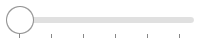
Slider is used to select a value by sliding a handle along a track.
In the example below, custom from, value, and to values are set:
  Slider {
      from: 1
      value: 25
      to: 100
  }
The position property is expressed as a fraction of the control's size, in the range 0.0 - 1.0. The visualPosition property is the same, except that it is reversed in a right-to-left application. The visualPosition is useful for positioning the handle when styling Slider. In the example above, visualPosition will be 0.24 in a left-to-right application, and 0.76 in a right-to-left application.
参见 Customizing Slider and Input Controls.
属性
handle : Item |
This property holds the handle item.
This property holds the orientation.
Possible values:
| Constant | Description |
|---|---|
Qt.Horizontal | Horizontal (default) |
Qt.Vertical | Vertical |
This property holds the logical position of the handle.
The position is expressed as a fraction of the control's size, in the range 0.0 - 1.0. For visualizing a slider, the right-to-left aware visualPosition should be used instead.
参见 value, visualPosition, and valueAt().
This property holds the snap mode.
Possible values:
| Constant | Description |
|---|---|
Slider.NoSnap | The slider does not snap (default). |
Slider.SnapAlways | The slider snaps while the handle is dragged. |
Slider.SnapOnRelease | The slider does not snap while being dragged, but only after the handle is released. |
In the following table, the various modes are illustrated with animations. The movement of the mouse cursor and the stepSize (0.2) are identical in each animation.
| Value | Example |
Slider.NoSnap |
|
Slider.SnapAlways |
|
Slider.SnapOnRelease |
|


参见 stepSize.
This property holds the step size. The default value is 0.0.
参见 snapMode, increase(), and decrease().
This property holds the value in the range from - to. The default value is 0.0.
参见 position.
This property holds the visual position of the handle.
The position is expressed as a fraction of the control's size, in the range 0.0 - 1.0. When the control is mirrored, the value is equal to 1.0 - position. This makes the value suitable for visualizing the slider, taking right-to-left support into account.
参见 position.
信号
This signal is emitted when the slider has been interactively moved by the user by either touch, mouse, wheel, or keys.
This QML signal was introduced in QtQuick.Controls 2.2.