
CheckDelegate QML Type
Item delegate with a check indicator that can be toggled on or off. 更多...
| Import Statement: | import QtQuick.Controls 2.2 |
| 开始支持版本: | Qt 5.7 |
| 基类: |
属性
- checkState : enumeration
- tristate : bool
详细描述
CheckDelegate presents an item delegate that can be toggled on (checked) or off (unchecked). Check delegates are typically used to select one or more options from a set of options in a list. For smaller sets of options, or for options that need to be uniquely identifiable, consider using CheckBox instead.
CheckDelegate inherits its API from ItemDelegate, which is inherited from AbstractButton. For instance, you can set text, and react to clicks using the AbstractButton API. The state of the check delegate can be set with the checked property.
In addition to the checked and unchecked states, there is a third state: partially checked. The partially checked state can be enabled using the tristate property. This state indicates that the regular checked/unchecked state can not be determined; generally because of other states that affect the check delegate. This state is useful when several child nodes are selected in a treeview, for example.
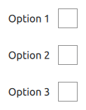
  ListView {
      model: ["Option 1", "Option 2", "Option 3"]
      delegate: CheckDelegate {
          text: modelData
      }
  }
参见 Customizing CheckDelegate, Delegate Controls, and CheckBox.
属性
This property determines the check state of the check delegate.
Available states:
| Constant | Description |
|---|---|
Qt.Unchecked | The delegate is unchecked. |
Qt.PartiallyChecked | The delegate is partially checked. This state is only used when tristate is enabled. |
Qt.Checked | The delegate is checked. |
This property determines whether the check delegate has three states.
In the animation below, the first checkdelegate is tri-state:
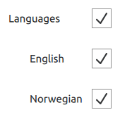
The default is false, i.e., the delegate has only two states.